Post by Adele on May 24, 2012 22:56:10 GMT -5
Hello Girls!!!
This week you need to submit a photo for your Covergirl Advertisement and our product for this cycle is Eye Shadow Covergirl SmokyShadowBlast.
Let's see your photo this week.
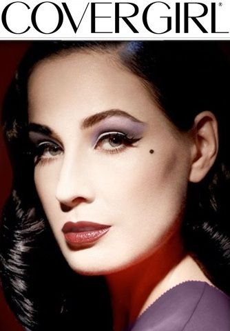
Amanda: I notice your mole immediately, long before I see the eye shadow. I know there's not much you can do about that, but it's a distraction. I do, however, like that the eyeshadow is subtle. I actually hate eyeshadow like this and find it tacky, and a little subtlety goes a long way for me. Your face is good, but I really don't like your hair here - it looks synthetic, and that's probably why this photo is just good for me. When you're supposed to be selling the eyeshadow... you really aren't. I still like it, but don't love it.
Hayley: Maybe it's because I knew the product I was looking for and it was positioned well in the photo, but I actually did notice your eyes before anything else. When I worried that the shading might be too light, I went back and looked at the pictures given as an example, and there was a lightly-shaded one. So, you fit the theme well enough for me. This is also about as close as Dita is going to get to ever being a CoverGirl model. The vibe of the photo is a little too dark for my tastes (in this shoot only). And there's no problem with a beauty mark. Cindy Crawford was huge in the 90s and known for her beauty mark.
Natalie: This is just okay for me as well. It looks realistic but it's not totally selling the eye shadow in my opinion. I appreciate your subtlety, but I wish your lips weren't so prominent. Not that it's bad, but I feel like there's just supposed to be one focus here. It's also so dark, which isn't stereotypical covergirl. Overall, it's just okay for me.
Adele: I think your expression is too serious in this photo but I love the styling. Very stylish and the color of eyeshadow looks great on you. I like your beauty mark. I don't think it distracted the photo. Overall, I think you did such a good job.
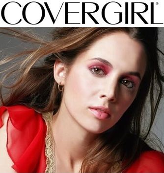
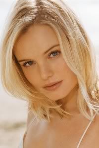
Adele: Beautiful. I love the fact that I knew it's an advertisement for eyeshadow from the moment I saw the photo. Not so sure the color looks great on you, but in term of styling, believability and commercial value, you did such a good job. I love the wind on your hair. Overall, I think you did great, Eliza!!! Good job!!
Amanda: I personally do not like this kind of eyeshadow... it just looks tacky and almost alien, but I have to judge objectively. Like Adele, I LOVE your hair here, and this is definitely a good ad for CoverGirl. It's pretty, though that eyeshadow is just not something I could see myself buying. I'm a mascara girl xD
Hayley: I have to agree with Adele that I'm not sure I like this shade on you, but it does really pop and we notice your eyes immediately. With the windblown hair and the colorful top poking up, you did need a strong, impactful color to really draw us into the product at a glance, so while the shade itself might not be my favorite, it's more beneficial than detrimental to you this round. I could see this working for CoverGirl, but maybe with a slightly different expression. This photo is almost there. A lot of positives, and a couple nit-picky negatives. So, overall, a good showing this week.
Natalie: I think you did very well this week, Eliza. You're selling the product well, which is a huge plus. I actually do like that shade on you, and your hair is gorgeous. Good job this week!
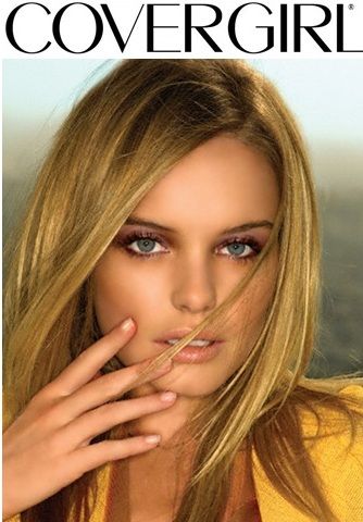
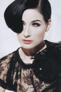
Amanda: I don't know if I see the eyeshadow here. I see something around your eyes, but you're not selling it. Although, personally, I kind of like that since I find this product to be tacky. This is a fierce shot, and I can actually see it being used for CoverGirl. It's something different but still within the realm of what they like. The hand is a unique touch, but again, it distracts from the eyes. The product connection is weak at best, which is the biggest flaw here. It's unfortunate, because this is a great modeling photo and that alone may be enough to help.
Hayley: I have to agree with Amanda here... I can see this being used as a CoverGirl ad, but I don't really see much eyeshadow. When I look closely, I can see it, but that's when I'm actually searching for is. This would have been a great shot for a skincare or possibly even a haircare product, but unfortunately, we're looking for eyeshadow this week...
Natalie: I have to agree with the girls who spoke before me. Your eyeshadow is nice and subtle, but you're not selling it. If I had to guess, you'd be selling your skin here since it's flawless. This is overall just okay for me.
Adele: I disagree with the girls. I think you look fantastic in this photo. I can see your eyeshadow. And you model it well. I love the graceful in your hand. The styling is fabulous. The connection is strong. I think you did great this week. Very commercial
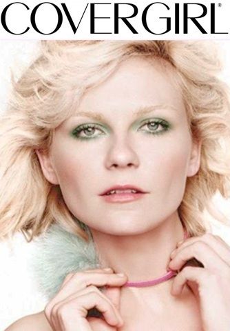
Amanda: I love the color you chose, because I love me some green. I'm not sold on the choker or the pose, since I don't know how "CoverGirl" it is, but I'm going to let it slide given what the product is. You look older here, and not in a good way - it's almost a zombified state given the makeup and the way it makes your eyes look. I'm guessing that's why I hate this product... it's not bringing out the best in anyone. You look good, it's just... yeah xD
Hayley: Your eyes really pop here, so that's an immediate plus. This photo also reads "CoverGirl" to me very well. The choker is the only part I have any reservations about because of the company this photo is supposed to fit, but that's a very minor problem in an otherwise fantastic photo. Great job, once again.
Natalie: I think you did well this shoot, all things considered. I'm not really convinced on your expression, but I think you did a fantastic cropping job here, so I'll commend you on that. The choker is throwing me off, since we wouldn't see that in a covergirl, but I do like your eyeshadow. This is good for me, but not great. It'd be great if you lost that thing around your neck!
Adele: My concern is more on your expression than the choker. You came across as a little bit tight and meany.. I want to see the commercial side of you more. On the other hand, I think you nailed other element really well. From the pose to the choice of the color of eyeshadow, you did amazing for that part.
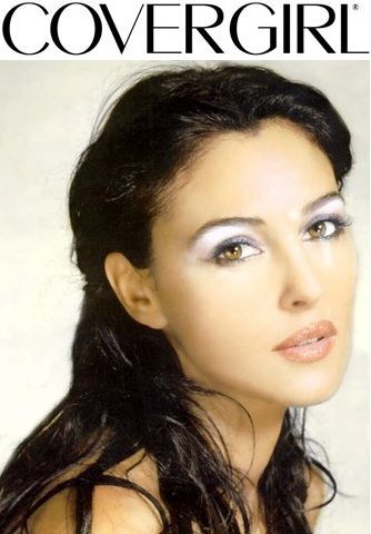
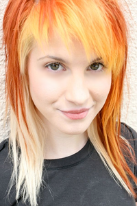
Amanda: You're... surrendering? That alone might get you eliminated, you know. Attitude is a good indicator. You really should SELL your photo. Not that you have to - I actually happen to like this, but I don't love it. It's a bit too greasy, and that may be due to your hair looking damp or the strange sensations in the background. Aside from that, this is beautiful. Breathtaking even. you have the eyeshadow,and it's subtle, yet there. You're selling it, without it being too overbearing and tacky. I can definitely see this as a justifiable CoverGirl shot all-around, but... it's just a bit too greasy for me. Thankfully it's not as atrocious in that department as a certain photo from Cycle 7..
Hayley: That's actually a really interesting shade to use for this shoot. You have a good level of makeup and the pose is fine. My only problem with this photo comes from the hair. I'm not liking the stringy look. The textured background is nice, but not distracting. Overall, I'd say this photo works well this shoot. The hair is just a big distraction for me.
Natalie: I'm not too sure about this, Monica. Your hair looks mangy to me... not sure if that's better or worse than greasy, but that's what I got. On the plus side, you DO look gorgeous here, and this is pretty covergirl-esque, however, I don't like the shade. It doesn't really look like eyeshadow to me, but some weird pale thing or something. I didn't get the shade, but your beauty helps here. Overall, just okay for me.
Adele: I like this photo. I think the pose is great and the hairstyle look gorgeous on you. I want more energy from you. I think that's what this photo needed most. Great angle especially for your face. Good job, Monica
This week you need to submit a photo for your Covergirl Advertisement and our product for this cycle is Eye Shadow Covergirl SmokyShadowBlast.
Let's see your photo this week.

Amanda: I notice your mole immediately, long before I see the eye shadow. I know there's not much you can do about that, but it's a distraction. I do, however, like that the eyeshadow is subtle. I actually hate eyeshadow like this and find it tacky, and a little subtlety goes a long way for me. Your face is good, but I really don't like your hair here - it looks synthetic, and that's probably why this photo is just good for me. When you're supposed to be selling the eyeshadow... you really aren't. I still like it, but don't love it.
Hayley: Maybe it's because I knew the product I was looking for and it was positioned well in the photo, but I actually did notice your eyes before anything else. When I worried that the shading might be too light, I went back and looked at the pictures given as an example, and there was a lightly-shaded one. So, you fit the theme well enough for me. This is also about as close as Dita is going to get to ever being a CoverGirl model. The vibe of the photo is a little too dark for my tastes (in this shoot only). And there's no problem with a beauty mark. Cindy Crawford was huge in the 90s and known for her beauty mark.
Natalie: This is just okay for me as well. It looks realistic but it's not totally selling the eye shadow in my opinion. I appreciate your subtlety, but I wish your lips weren't so prominent. Not that it's bad, but I feel like there's just supposed to be one focus here. It's also so dark, which isn't stereotypical covergirl. Overall, it's just okay for me.
Adele: I think your expression is too serious in this photo but I love the styling. Very stylish and the color of eyeshadow looks great on you. I like your beauty mark. I don't think it distracted the photo. Overall, I think you did such a good job.

Adele: Beautiful. I love the fact that I knew it's an advertisement for eyeshadow from the moment I saw the photo. Not so sure the color looks great on you, but in term of styling, believability and commercial value, you did such a good job. I love the wind on your hair. Overall, I think you did great, Eliza!!! Good job!!
Amanda: I personally do not like this kind of eyeshadow... it just looks tacky and almost alien, but I have to judge objectively. Like Adele, I LOVE your hair here, and this is definitely a good ad for CoverGirl. It's pretty, though that eyeshadow is just not something I could see myself buying. I'm a mascara girl xD
Hayley: I have to agree with Adele that I'm not sure I like this shade on you, but it does really pop and we notice your eyes immediately. With the windblown hair and the colorful top poking up, you did need a strong, impactful color to really draw us into the product at a glance, so while the shade itself might not be my favorite, it's more beneficial than detrimental to you this round. I could see this working for CoverGirl, but maybe with a slightly different expression. This photo is almost there. A lot of positives, and a couple nit-picky negatives. So, overall, a good showing this week.
Natalie: I think you did very well this week, Eliza. You're selling the product well, which is a huge plus. I actually do like that shade on you, and your hair is gorgeous. Good job this week!

Amanda: I don't know if I see the eyeshadow here. I see something around your eyes, but you're not selling it. Although, personally, I kind of like that since I find this product to be tacky. This is a fierce shot, and I can actually see it being used for CoverGirl. It's something different but still within the realm of what they like. The hand is a unique touch, but again, it distracts from the eyes. The product connection is weak at best, which is the biggest flaw here. It's unfortunate, because this is a great modeling photo and that alone may be enough to help.
Hayley: I have to agree with Amanda here... I can see this being used as a CoverGirl ad, but I don't really see much eyeshadow. When I look closely, I can see it, but that's when I'm actually searching for is. This would have been a great shot for a skincare or possibly even a haircare product, but unfortunately, we're looking for eyeshadow this week...
Natalie: I have to agree with the girls who spoke before me. Your eyeshadow is nice and subtle, but you're not selling it. If I had to guess, you'd be selling your skin here since it's flawless. This is overall just okay for me.
Adele: I disagree with the girls. I think you look fantastic in this photo. I can see your eyeshadow. And you model it well. I love the graceful in your hand. The styling is fabulous. The connection is strong. I think you did great this week. Very commercial

Amanda: I love the color you chose, because I love me some green. I'm not sold on the choker or the pose, since I don't know how "CoverGirl" it is, but I'm going to let it slide given what the product is. You look older here, and not in a good way - it's almost a zombified state given the makeup and the way it makes your eyes look. I'm guessing that's why I hate this product... it's not bringing out the best in anyone. You look good, it's just... yeah xD
Hayley: Your eyes really pop here, so that's an immediate plus. This photo also reads "CoverGirl" to me very well. The choker is the only part I have any reservations about because of the company this photo is supposed to fit, but that's a very minor problem in an otherwise fantastic photo. Great job, once again.
Natalie: I think you did well this shoot, all things considered. I'm not really convinced on your expression, but I think you did a fantastic cropping job here, so I'll commend you on that. The choker is throwing me off, since we wouldn't see that in a covergirl, but I do like your eyeshadow. This is good for me, but not great. It'd be great if you lost that thing around your neck!
Adele: My concern is more on your expression than the choker. You came across as a little bit tight and meany.. I want to see the commercial side of you more. On the other hand, I think you nailed other element really well. From the pose to the choice of the color of eyeshadow, you did amazing for that part.

Amanda: You're... surrendering? That alone might get you eliminated, you know. Attitude is a good indicator. You really should SELL your photo. Not that you have to - I actually happen to like this, but I don't love it. It's a bit too greasy, and that may be due to your hair looking damp or the strange sensations in the background. Aside from that, this is beautiful. Breathtaking even. you have the eyeshadow,and it's subtle, yet there. You're selling it, without it being too overbearing and tacky. I can definitely see this as a justifiable CoverGirl shot all-around, but... it's just a bit too greasy for me. Thankfully it's not as atrocious in that department as a certain photo from Cycle 7..
Hayley: That's actually a really interesting shade to use for this shoot. You have a good level of makeup and the pose is fine. My only problem with this photo comes from the hair. I'm not liking the stringy look. The textured background is nice, but not distracting. Overall, I'd say this photo works well this shoot. The hair is just a big distraction for me.
Natalie: I'm not too sure about this, Monica. Your hair looks mangy to me... not sure if that's better or worse than greasy, but that's what I got. On the plus side, you DO look gorgeous here, and this is pretty covergirl-esque, however, I don't like the shade. It doesn't really look like eyeshadow to me, but some weird pale thing or something. I didn't get the shade, but your beauty helps here. Overall, just okay for me.
Adele: I like this photo. I think the pose is great and the hairstyle look gorgeous on you. I want more energy from you. I think that's what this photo needed most. Great angle especially for your face. Good job, Monica

