Post by Adele on May 2, 2012 7:40:15 GMT -5
Hello Girls!!!
Welcome to your Fifth Judging Session. This week you need to submit us a "Sexy" photo and also describe to us the meaning of "Sexy" from your point of views.
Let's start our judging session now
Ashley "Sexy Is Sensual"

Adele: The red things on your dress kinda distracted me a little bit but I love your body language. You look beautiful but I want to see more emotion on your face. You still looked sexy though.
Natalie: This is just okay for me. I think you're stronger than this. You come across as more dead than sensual, but your dress/styling is gorgeous, as is your setting.
Amanda: I want to unsee those ruffles. BURN THEM! Though to be honest, without those ugly distractions in the picture, it would be really, really good. Your pose is great, the setting works, I LOVE your hair, and the rest of your dress is fantastic. It's just that those big red ruffles take center stage, not to mention they're something out of a 70s horror flick. This just goes to show you how one thing can really kill an otherwise good photograph. Won't be enough to get you out though!
Hayley: Not a big fan of the red pedals bursting from your chest, but otherwise, a good photo. The pose works and the black part of the dress is nice. Just the right amount of makeup, too.
Britney "Sexy is Fierce"

Adele: I like the concept. Very good. I do think you look fierce. Love the accessories. I also love the fact that you manage to give us "Sexy" just with your face. Good job
Natalie: I really like this. I think you're fierce, and you're not over the top. I also really like your accessories. Good job this week!
Amanda: I don't find this "sexy." I find it fierce, yes. I like the vibe you give off and the accessories and it's truly a great photo. I just don't see "sexy." I see "fierce" and "sexy is fierce," but I'm not completely sold on that combination. Show off some body! Show off more hawt!
Hayley: As far as "Sexy is Fierce", this works. Just like last round, I would have liked to have seen more of your body; especially for the theme you were given this week. Showing more of your body, depending upon how you pose it, could have made this picture phenomenal. Instead, I'd say it's good, but lacking.
Danielle "Sexy is Long Legs"
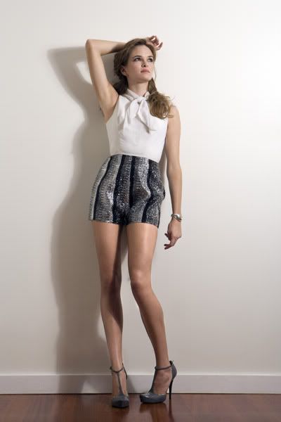
Adele: You looked a little bit stiff in the photo. The styling is very cute and appropriate for your age. I wish you would work more on your pose, so it doesn't look like you just standing there. Beside that, energy!!! No matter what, I love your legs and your overall look this week.
Natalie: Your legs are really sexy! Unfortunately, the rest of this photo just falls flat for me. The shadow doesn't do much, and I wish you were looking at the camera. This is just okay for me, sorry.
Amanda: I'm going to echo my friends. Your legs are delicious, but that's really about it. You need to look at the camera! You need to show off more! Your styling is boring - you're almost "schoolgirl" but not to that point. You need energy, you need to go beyond this, you need that passion you lack, you need to OWN it, and you don't. This is just okay. Your legs are amazing, but everything else is just bland. Hope that's enough!
Hayley: I almost just copied and pasted Natalie's critique, but I guess I should type it up myself. I do like your legs in this picture, and they are definitely long. Great pose to show off the legs. However, I'm not fond of the rest of the picture. It all looks very plain. You look like an attractive woman (which you are), but this photo doesn't really sell "Sexy is..." to me.
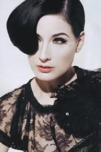
Dita "Sexy is Freedom"

Adele: I expected cleavage, boobs and hoochieness from you, but I glad that you picked this route since this photo is still sexy in it's own way. You looked free, amazing and flawless in the photo. I also love your face expression in this photo. Serene + Sexy!!!
Natalie: I think you did a really good job this week. You look extremely classy, and I like the effect of the sheet with the contour of your body. I also really like your meaning. Good job!
Amanda: Not what I expected. It is a good thing. I'm not sure about your face, but your body is magnificent while staying classy and sexy. I love your hair, I like your eyes, but again... they don't completely go with the rest of your face. The pose is good, and although I would like a setting, it's fine as is. Good job.
Hayley: I had no doubt that you'd rock this shoot and I doubt anyone else is going to be surprised, either. That's about as close to nude as we can get on Proboards before they delete the forum. However, you're still staying very classy in this photo. It's actually a big reason why I love Dita Von Teese so much despite not being attracted to women. Dita has a very artistic way of showing off her body. She always stays classy and has a great sense of style. That definitely shows through in this picture.
Eliza "Sexy is Loving Yourself"

Adele: A little bit boring for me, Eliza. The outfit especially the color didn't really appealing for me. I want more energy too. You look very tired in the photo. I love the concept which is about loving yourself though. I can see the potential of this photo to be better than this.
Natalie: At first, I loved it, and then I didn't like it, and now I love it again. I think you have a really, really strong meaning, and I would say that you look more seductive than tired. Your clothes could be more interesting, but I'm not too bothered by it. I'm a fan this week!
Amanda: Hated your tagline until you explained it. Now I like it. The photo, though, is boring for me also. You don't stand out here. The styling and setting are sort of monochromatic, which is a bad thing in a shot that's about selling yourself. You do look sexy, it's just that the styling, surroundings, and your face don't sell it to the point that it could. This is just okay for me after all things considered :/
Hayley: Not the route I thought you'd take for this shoot, and I'm happy about that. Eliza is definitely a dark, badass chick, but I'm happy to see a softer side of you, while still maintaining (at the core) who you are. I'm not the biggest fan of your attire for the photo, but the posing, styling, and makeup are all nice. It'll just be a matter of how this photo stacks up against the others cause there are quite a few people doing well this week.
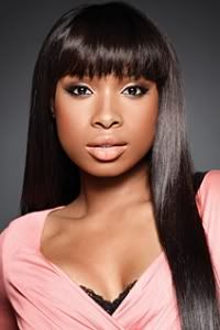
Jennifer "Sexy is Feeling Comfortable In Your Own Skin"

Adele: I love the curve and I knew us plus size girl should stick together but for me this photo is so stiff. I'm not a fan of the styling. Too messy. I don't think the color of your dress compliment you really well. Mostly my issue with your photo this week is with your styling. I want more energy too.
Natalie: I, unfortunately, agree with Adele. I really like your theme, and I support it, but I don't think you actually look comfortable here. Also, the blue doesn't really go well with much of anything. Sorry J-Hud, you can do better than this!
Amanda: No. Not sexy, not comfortable, and most definitely really tired. I don't like the beads, I don't like the hair, your outfit stands out way more than you do, and your plus-siziness shows a bit too much. Sorry Jennifer, I must agree with the others. your idea is there, your execution is not.
Hayley: I have no problem with you being "plus-sized" in this photo. Women with curves can be sexy, too. The dress is fine, but I feel like there are dresses out there that would be more flattering than that. I like the color for it, though. I also love the hairstyle. Part of the reason why I picked you for the makeover was because I felt that hairstyle framed your face better. I do have a problem with your face in this picture, though. Or, actually, it's probably the posing. Maybe it's the two in conjunction. Either way, it makes you look unsure of yourself. And when your "Sexy is..." is being comfortable with yourself, that's definitely a big negative.
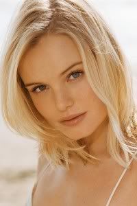
Kate "Sexy is Having Flawless Skin"
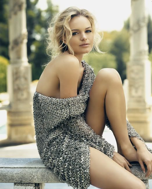
Adele: Very beautiful. I love the combination of sexy with innocence in your photo. Less excitement from your last photo but this photo is still one of the better photos for this week. Good job
Natalie: I feel like your meaning is a little shallow, but you executed it perfectly and look amazing. Another great job from you, Kate!
Amanda: I'm with Natalie on this. Your skin IS flawless, but the meaning is shallow. You look very beautiful, more "gorgeous" than "sexy." You look a bit older, more sophisticated, and it's a different kind of sexy. I do like it. I like that you have a setting, I love your innocent expression, and you're definitely one of the frontrunners here. Great work
Hayley: I must have missed the part where the "Sexy is..." was supposed to have emotional depth, cause I don't care that you chose a shallow route. Your skin is definitely flawless and I love how that sweater hangs off of your body. The slightly tousled hair works well, too. You definitely look beautiful in this photo and you're definitely safe with it. How high you place this round will depend upon how sexy your photo is compared to some of the other girls. At least for me it'll come down to that.
Kirsten "Sexy is Photogenic"

Adele: Definitely sexy. Amanda probably has an idea for your phrase since I think "Sexy is Photogenic" is too underrated for your photo this week. I love the fact that you shown versatility in your photo, Kirsten. Amazing job again.
Natalie: You do look gorgeous here, but I'm not really buying the theme. It's just sort of redundant in itself. You've picked a really strong photo, as always, but I wish the theme would be stronger, like Adele said. Not your best week, but I don't think you're in danger.
Amanda: Since Adele put me up to the task, hmmm... based off of your description...
"Sexy is all in the smize"
"Sexy is for bedtime"
"Sexy is rejuvenating"
Unfortunately, I must agree that what you do have is weak. I also am not sure about the "smize" factor here. You're like glaring at me. It might be the lighting, because that's a pretty big issue. I won't deny that you do look gorgeous, but the lighting is just all kinds of UGH for me here. It's nowhere near your best photo, but you're not in danger, so don't worry about it.
Hayley: Ok, seriously, is there going to be a shoot where you don't have a fantastic picture? I always thought of Kirsten Dunst as having that "Girl Next Door" look and I thought you'd be incapable of producing a really sexy photo. Here, you've proven my doubts wrong. However, I HATE the phrase your chose for your theme and in a round where you get to choose at least part of your theme, that has to factor into my decision. Photo alone, another fantastic job this round.
Kristen "Sexy is Mysterious"

Adele: The concept is there. But I think the angle of this photo doesn't really help you. I still think you look sexy and confidence. I think this photo is enough to carry you to the next week.
Natalie: I feel like Adele and I are disagreeing quite a bit today! I actually really like this whole thing. I like the use of the mirror in conjunction with the concept. I think this is one of your strongest yet, Kristen!
Amanda: I'm in the middle here. I LOVE the idea and your tagline, but the execution isn't the most "sexy" for me. You look cute, but just cute. I hate your shirt. TAKE IT OFF! It's just so BAGGY and un-sexy. I mean, it's GRAY. It's BLAND. Get rid of that and you have something amazing. This is just decent for me because of it.
Hayley: I love the tagline, but I don't feel it connects as well to the photo as it could. I do love the concept behind that actual photo itself. Unlike Amanda, I have no problem with your grey romper. It's a little reminiscent of a girl wearing her boyfriend's shirt to bed and that can look sexy. I love your face in the photo, too. It's not the strongest we're seeing this round, but I like it more than I've liked quite a few of your photos in this competition. This is just a tough round as a lot of people are doing well, but I think you'll be fine.
Marion "Sexy is Awareness Of Your Beauty"

Adele: I think you shown you attributes really well in the photo. The setting is simple but cute and you don't have any problem with your styling. Always dress to impress. Not so sure with the lighting in your face but it didn't really affect on my opinion towards the photo. Amazing
Natalie: I love this. The lighting is great, as is your expression, pose, and basically everything else. You really impressed me this week, Marion! I think you also have a strong concept. Good job!
Amanda: I personally do not like the lighting or the setting. It makes this photo feel like something from the 60s, especially when mixed with the setting and your hair like that. You ARE hot, that's for sure, and you ARE aware of it, and that will win you a lot of points. I'm not completely sold on this, though... but I do like it.
Hayley: I hate the lighting and it was the first thing I noticed. As a matter of fact, I haven't even looked at the rest of the photo, yet. I just saw the lighting and immediately scrolled down to type about how much I hated it. Ok, now that I've looked at the rest of your photo, it's definitely a mixed bag for me. I hate the fabric that your top is made out of, but I like the way it hangs off of you. I just wish it didn't look like a cheap outdoor tablecloth. How you're posing your body is fantastic, though. I'm fine with the setting. Could have been better, could have been worse. I like your tagline and it relates to the picture itself well.
Monica "Sexy is Timeless"
Proboards Warning
Adele: Sexy!!! I think this is my favorite from you so far. You look elegant and I love the concept of this photo. Not so many people can still look classy without any clothes but you are here. I love the setting. Suitable for this week theme. Good Job!!!
Natalie: This is a photo where I think black and white enhances your overall message. I think you have a strong concept, and you're not trashy despite it being a nude shot. Good job this week, Monica! You took a risk and it paid off in my mind!
Amanda: This is delicious. I almost don't recognize you here, but this is fantastic. I love the black and white, and I love a tastefully done nude. Your face is cute. Your hair is awesome. The setting is awesome. It's a risk. And it's paying off. Wonderful work, Monica
Hayley: Overall, I really like this photo. The black and white adds a nice element to it. Had it been in color, it would have looked more like a Playboy shot. I do wish your right arm was positioned a little further out. While this is generally a classy photo, I feel it would have felt a bit more classy if the nipples weren't so exposed. Then again, that could just be my prudish American upbringing there. I love your tagline and how you explained it. You definitely thought outside the box with this one and it works to your favor. Great job this week.
Welcome to your Fifth Judging Session. This week you need to submit us a "Sexy" photo and also describe to us the meaning of "Sexy" from your point of views.
Let's start our judging session now
Ashley "Sexy Is Sensual"

Adele: The red things on your dress kinda distracted me a little bit but I love your body language. You look beautiful but I want to see more emotion on your face. You still looked sexy though.
Natalie: This is just okay for me. I think you're stronger than this. You come across as more dead than sensual, but your dress/styling is gorgeous, as is your setting.
Amanda: I want to unsee those ruffles. BURN THEM! Though to be honest, without those ugly distractions in the picture, it would be really, really good. Your pose is great, the setting works, I LOVE your hair, and the rest of your dress is fantastic. It's just that those big red ruffles take center stage, not to mention they're something out of a 70s horror flick. This just goes to show you how one thing can really kill an otherwise good photograph. Won't be enough to get you out though!
Hayley: Not a big fan of the red pedals bursting from your chest, but otherwise, a good photo. The pose works and the black part of the dress is nice. Just the right amount of makeup, too.
Britney "Sexy is Fierce"

Adele: I like the concept. Very good. I do think you look fierce. Love the accessories. I also love the fact that you manage to give us "Sexy" just with your face. Good job
Natalie: I really like this. I think you're fierce, and you're not over the top. I also really like your accessories. Good job this week!
Amanda: I don't find this "sexy." I find it fierce, yes. I like the vibe you give off and the accessories and it's truly a great photo. I just don't see "sexy." I see "fierce" and "sexy is fierce," but I'm not completely sold on that combination. Show off some body! Show off more hawt!
Hayley: As far as "Sexy is Fierce", this works. Just like last round, I would have liked to have seen more of your body; especially for the theme you were given this week. Showing more of your body, depending upon how you pose it, could have made this picture phenomenal. Instead, I'd say it's good, but lacking.
Danielle "Sexy is Long Legs"

Adele: You looked a little bit stiff in the photo. The styling is very cute and appropriate for your age. I wish you would work more on your pose, so it doesn't look like you just standing there. Beside that, energy!!! No matter what, I love your legs and your overall look this week.
Natalie: Your legs are really sexy! Unfortunately, the rest of this photo just falls flat for me. The shadow doesn't do much, and I wish you were looking at the camera. This is just okay for me, sorry.
Amanda: I'm going to echo my friends. Your legs are delicious, but that's really about it. You need to look at the camera! You need to show off more! Your styling is boring - you're almost "schoolgirl" but not to that point. You need energy, you need to go beyond this, you need that passion you lack, you need to OWN it, and you don't. This is just okay. Your legs are amazing, but everything else is just bland. Hope that's enough!
Hayley: I almost just copied and pasted Natalie's critique, but I guess I should type it up myself. I do like your legs in this picture, and they are definitely long. Great pose to show off the legs. However, I'm not fond of the rest of the picture. It all looks very plain. You look like an attractive woman (which you are), but this photo doesn't really sell "Sexy is..." to me.
Dita "Sexy is Freedom"

Adele: I expected cleavage, boobs and hoochieness from you, but I glad that you picked this route since this photo is still sexy in it's own way. You looked free, amazing and flawless in the photo. I also love your face expression in this photo. Serene + Sexy!!!
Natalie: I think you did a really good job this week. You look extremely classy, and I like the effect of the sheet with the contour of your body. I also really like your meaning. Good job!
Amanda: Not what I expected. It is a good thing. I'm not sure about your face, but your body is magnificent while staying classy and sexy. I love your hair, I like your eyes, but again... they don't completely go with the rest of your face. The pose is good, and although I would like a setting, it's fine as is. Good job.
Hayley: I had no doubt that you'd rock this shoot and I doubt anyone else is going to be surprised, either. That's about as close to nude as we can get on Proboards before they delete the forum. However, you're still staying very classy in this photo. It's actually a big reason why I love Dita Von Teese so much despite not being attracted to women. Dita has a very artistic way of showing off her body. She always stays classy and has a great sense of style. That definitely shows through in this picture.
Eliza "Sexy is Loving Yourself"

Adele: A little bit boring for me, Eliza. The outfit especially the color didn't really appealing for me. I want more energy too. You look very tired in the photo. I love the concept which is about loving yourself though. I can see the potential of this photo to be better than this.
Natalie: At first, I loved it, and then I didn't like it, and now I love it again. I think you have a really, really strong meaning, and I would say that you look more seductive than tired. Your clothes could be more interesting, but I'm not too bothered by it. I'm a fan this week!
Amanda: Hated your tagline until you explained it. Now I like it. The photo, though, is boring for me also. You don't stand out here. The styling and setting are sort of monochromatic, which is a bad thing in a shot that's about selling yourself. You do look sexy, it's just that the styling, surroundings, and your face don't sell it to the point that it could. This is just okay for me after all things considered :/
Hayley: Not the route I thought you'd take for this shoot, and I'm happy about that. Eliza is definitely a dark, badass chick, but I'm happy to see a softer side of you, while still maintaining (at the core) who you are. I'm not the biggest fan of your attire for the photo, but the posing, styling, and makeup are all nice. It'll just be a matter of how this photo stacks up against the others cause there are quite a few people doing well this week.
Jennifer "Sexy is Feeling Comfortable In Your Own Skin"

Adele: I love the curve and I knew us plus size girl should stick together but for me this photo is so stiff. I'm not a fan of the styling. Too messy. I don't think the color of your dress compliment you really well. Mostly my issue with your photo this week is with your styling. I want more energy too.
Natalie: I, unfortunately, agree with Adele. I really like your theme, and I support it, but I don't think you actually look comfortable here. Also, the blue doesn't really go well with much of anything. Sorry J-Hud, you can do better than this!
Amanda: No. Not sexy, not comfortable, and most definitely really tired. I don't like the beads, I don't like the hair, your outfit stands out way more than you do, and your plus-siziness shows a bit too much. Sorry Jennifer, I must agree with the others. your idea is there, your execution is not.
Hayley: I have no problem with you being "plus-sized" in this photo. Women with curves can be sexy, too. The dress is fine, but I feel like there are dresses out there that would be more flattering than that. I like the color for it, though. I also love the hairstyle. Part of the reason why I picked you for the makeover was because I felt that hairstyle framed your face better. I do have a problem with your face in this picture, though. Or, actually, it's probably the posing. Maybe it's the two in conjunction. Either way, it makes you look unsure of yourself. And when your "Sexy is..." is being comfortable with yourself, that's definitely a big negative.
Kate "Sexy is Having Flawless Skin"

Adele: Very beautiful. I love the combination of sexy with innocence in your photo. Less excitement from your last photo but this photo is still one of the better photos for this week. Good job
Natalie: I feel like your meaning is a little shallow, but you executed it perfectly and look amazing. Another great job from you, Kate!
Amanda: I'm with Natalie on this. Your skin IS flawless, but the meaning is shallow. You look very beautiful, more "gorgeous" than "sexy." You look a bit older, more sophisticated, and it's a different kind of sexy. I do like it. I like that you have a setting, I love your innocent expression, and you're definitely one of the frontrunners here. Great work

Hayley: I must have missed the part where the "Sexy is..." was supposed to have emotional depth, cause I don't care that you chose a shallow route. Your skin is definitely flawless and I love how that sweater hangs off of your body. The slightly tousled hair works well, too. You definitely look beautiful in this photo and you're definitely safe with it. How high you place this round will depend upon how sexy your photo is compared to some of the other girls. At least for me it'll come down to that.
Kirsten "Sexy is Photogenic"

Adele: Definitely sexy. Amanda probably has an idea for your phrase since I think "Sexy is Photogenic" is too underrated for your photo this week. I love the fact that you shown versatility in your photo, Kirsten. Amazing job again.
Natalie: You do look gorgeous here, but I'm not really buying the theme. It's just sort of redundant in itself. You've picked a really strong photo, as always, but I wish the theme would be stronger, like Adele said. Not your best week, but I don't think you're in danger.
Amanda: Since Adele put me up to the task, hmmm... based off of your description...
"Sexy is all in the smize"
"Sexy is for bedtime"
"Sexy is rejuvenating"
Unfortunately, I must agree that what you do have is weak. I also am not sure about the "smize" factor here. You're like glaring at me. It might be the lighting, because that's a pretty big issue. I won't deny that you do look gorgeous, but the lighting is just all kinds of UGH for me here. It's nowhere near your best photo, but you're not in danger, so don't worry about it.
Hayley: Ok, seriously, is there going to be a shoot where you don't have a fantastic picture? I always thought of Kirsten Dunst as having that "Girl Next Door" look and I thought you'd be incapable of producing a really sexy photo. Here, you've proven my doubts wrong. However, I HATE the phrase your chose for your theme and in a round where you get to choose at least part of your theme, that has to factor into my decision. Photo alone, another fantastic job this round.
Kristen "Sexy is Mysterious"

Adele: The concept is there. But I think the angle of this photo doesn't really help you. I still think you look sexy and confidence. I think this photo is enough to carry you to the next week.
Natalie: I feel like Adele and I are disagreeing quite a bit today! I actually really like this whole thing. I like the use of the mirror in conjunction with the concept. I think this is one of your strongest yet, Kristen!
Amanda: I'm in the middle here. I LOVE the idea and your tagline, but the execution isn't the most "sexy" for me. You look cute, but just cute. I hate your shirt. TAKE IT OFF! It's just so BAGGY and un-sexy. I mean, it's GRAY. It's BLAND. Get rid of that and you have something amazing. This is just decent for me because of it.
Hayley: I love the tagline, but I don't feel it connects as well to the photo as it could. I do love the concept behind that actual photo itself. Unlike Amanda, I have no problem with your grey romper. It's a little reminiscent of a girl wearing her boyfriend's shirt to bed and that can look sexy. I love your face in the photo, too. It's not the strongest we're seeing this round, but I like it more than I've liked quite a few of your photos in this competition. This is just a tough round as a lot of people are doing well, but I think you'll be fine.
Marion "Sexy is Awareness Of Your Beauty"

Adele: I think you shown you attributes really well in the photo. The setting is simple but cute and you don't have any problem with your styling. Always dress to impress. Not so sure with the lighting in your face but it didn't really affect on my opinion towards the photo. Amazing
Natalie: I love this. The lighting is great, as is your expression, pose, and basically everything else. You really impressed me this week, Marion! I think you also have a strong concept. Good job!
Amanda: I personally do not like the lighting or the setting. It makes this photo feel like something from the 60s, especially when mixed with the setting and your hair like that. You ARE hot, that's for sure, and you ARE aware of it, and that will win you a lot of points. I'm not completely sold on this, though... but I do like it.
Hayley: I hate the lighting and it was the first thing I noticed. As a matter of fact, I haven't even looked at the rest of the photo, yet. I just saw the lighting and immediately scrolled down to type about how much I hated it. Ok, now that I've looked at the rest of your photo, it's definitely a mixed bag for me. I hate the fabric that your top is made out of, but I like the way it hangs off of you. I just wish it didn't look like a cheap outdoor tablecloth. How you're posing your body is fantastic, though. I'm fine with the setting. Could have been better, could have been worse. I like your tagline and it relates to the picture itself well.
Monica "Sexy is Timeless"
Proboards Warning
Adele: Sexy!!! I think this is my favorite from you so far. You look elegant and I love the concept of this photo. Not so many people can still look classy without any clothes but you are here. I love the setting. Suitable for this week theme. Good Job!!!
Natalie: This is a photo where I think black and white enhances your overall message. I think you have a strong concept, and you're not trashy despite it being a nude shot. Good job this week, Monica! You took a risk and it paid off in my mind!
Amanda: This is delicious. I almost don't recognize you here, but this is fantastic. I love the black and white, and I love a tastefully done nude. Your face is cute. Your hair is awesome. The setting is awesome. It's a risk. And it's paying off. Wonderful work, Monica

Hayley: Overall, I really like this photo. The black and white adds a nice element to it. Had it been in color, it would have looked more like a Playboy shot. I do wish your right arm was positioned a little further out. While this is generally a classy photo, I feel it would have felt a bit more classy if the nipples weren't so exposed. Then again, that could just be my prudish American upbringing there. I love your tagline and how you explained it. You definitely thought outside the box with this one and it works to your favor. Great job this week.

