Post by Adele on Apr 22, 2012 9:11:23 GMT -5
Hello Girls!!!
Welcome to your Second Judging Session for this cycle. This week you need to submit a photo for a Romance Novel and also come with up with the title of your novel.
Let's see how you girls did this week
Ashley "What Love Is?"

Adele: Beautiful. I love the chemistry between you guys. I love the setting. Very romantic and loving. My only concern is Kellan kinda stole the limelight here from you a little bit but overall, I still think this is a lovely shoot, Ash
Amanda: Not so sure on your title. Your photo, however, is great - you two clearly are connecting AND it looks like a photoshoot. You're snuggling up to him, making him happy, and it's just wonderful. The styling is nothing special, but it doesn't need to be - you're two normal college students ready to get into something more serious. But... I really don't like how your eyes are closed, because this sort of makes him to be the protagonist, or rather, who I'd expect to be. It's a cute shoot, but you don't pop out at me like you could. Despite that, this is still quite strong, so good work Ash <3
Hayley: When I look at this photo, my eyes are drawn to the guy. He does strike me as the main subject of the photo and it's for the reason that Amanda has already listed: his eyes are open and your eyes aren't. That said, this is a nice photo for a romance novel. I love your styling in this and the only thing I would have liked better about this photo would have been you focusing on the camera while he focused on you. Instead, we get you focusing on him and he's focusing on the camera.
Natalie: I don't have much more to say here. You're obviously connected, but my attention also goes to the guy. Still, you did a good job. Open eyes and this would be a lot better!
Britney "The Rebel & The Seductress Housekeeper"

Adele: Wow, at the synopsis. I can imagine the whole story of that novel. Very sexy. Overall, it's an okay photo. But I want more from you. I'm not really feel the connection between you and Kevin. But I really the concept of your novel. Interesting.
Amanda: Your synopsis sells this book to me, and I'm glad you thought that out. Very good work there. Your photo, however, is a bit too much - the styling almost goes overboard, and though it is sexy, the cigarette he has is a bad thing. He doesn't seem as interested in you as you are in him. He's just like, "Yeah." to this whole thing. You do steal the spotlight, and although the photo is small, it still looks professional even with the punky styling. I happen to like it, but I don't love it - for reasons already mentioned. Good job.
Hayley: Your synopsis does do a good job selling the photo. It's still not my favorite, but it does help. This almost seems like a farcical romance novel. You being dressed up as a housekeeper works since that's a common recurring theme for a stereotypical male fantasy of a woman. However, K-Fed makes me not take this picture seriously and is a bit distracting. In the end, I like you in the photo.
Natalie: I think you did a really good job selling the book, and I love that. However, the cover itself comes across as a bit hoochie, and I feel like that doesn't represent you as well as it could in a modelling game. However, I still really like the storyline, so good job!!
Danielle "Remembering Samantha"
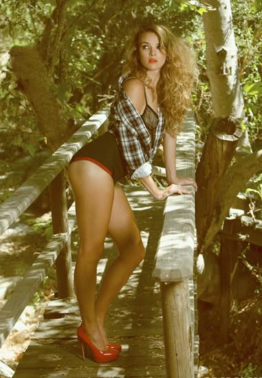
Amanda: You're about six hours past deadline, you realize. That's a lot more than 17 minutes, and that's going to cost you some points. Now, I do like this photo, but I don't see it as a romance cover. You're really sexy, but to be honest... you look kind of slutty. You don't look like you're interested in anything serious, anything long-term. Now I could see justification for a romance novel, but you didn't give it to us, so I'm forced to rely on my own English-major mind to come up with one. Given the unromantic setting - or rather, the lack of a partner to share this seclusion with - I'd say you might be at some state park looking for a big, gruff hiker dude to sleep with. You're looking for someone who isn't looking for you, and you're showing off your ass to passerby to hopefully get something in it. Yeah, this is R-rated. And it sounds cheesy. I do like how sexy you are, but I just don't know, and your lateness is pretty serious...
Hayley: I'll follow Amanda's lead in that I'l dock you a few points when I rank you, but not give you automatic last. This is a picture that a backstory probably could have helped. There seems to be a bit of a disconnect between your styling and the setting of the photo. I can see it working for the theme this week, though. Maybe the city girls falls for a country boy and it's a bit of a fish-out-of-water romance story. I like that we see a sexual side of you since that's often a good selling point for this type of novel.
Natalie: Yeah, I'm going to have to dock you for being 6 hours late as well. I'm sorry, but it's only fair. A backstory here could have helped, but it's also a tad unfortunate that you came after Britney, who wrote a wonderful backstory. This photo does have strong modelling aspects, so that'll help in the end. I namely like the shoes, pose, lipstick and hair.
Adele: Good photo. But your ranking this week definitely will be affected by your lateness. I love the setting. Not really a fan of the lighting. I love your look in this photo. Very edgy.
Dita "The Succubus"

Adele: This is definitely your niche. You look hot and sensual. I can see this photo as a cover for romance novel. I really like the angle of the photo. Good job, Dita.
Amanda: I see the relation to the other one you posted. Very nice. This is just as good as that one is - it's not the greatest cover ever or anything, but it's something eye-catching. Definitely getting hot in here. The setting is fantastic, the styling is good, though what the hell are those black dots? There's one below your chin and another near your eyebrow. Oh wait the second one is a mole, my error. I really do like this, and it fits nicely. Good work!
Hayley: I'd be very disappointed in you if you didn't do well this week. This absolutely works for a romance novel. The styling and posing is fantastic and there's very little to complain about. My only actual complaint is that towards your legs, the photo seems to get a bit blurry. Not that bad, but the quality of the picture isn't 100% spot on. Otherwise, I really like what you've done this week.
Natalie: I, too, really like this. I do think this is your niche and I think you did a strong job. The modelling aspects are strong, and the cover is a nice touch. I really don't have anything bad to say about this!
Eliza "The Other Side of the Bed"

Adele: You look very beautiful. I love your hair in this photo. Sexy. The concept is simple but it worked out well for you. The strongest element in this photo is your emotion. I can feel it.
Amanda: I love this. I really, really love this. You look so vulnerable and worried, yet you have that lust. I connect to you a LOT here. I love your hair, the styling, and the setting is spectacular. Crop it a bit and you've definitely got yourself a real romance cover - something I'd be interested in looking at. This is definitely an improvement over last round. Great work
Hayley: A lot stronger than your previous photo. This photo has much better clarity and you look beautiful in it. I like the vulnerability you exude in this photo since it suggests the story will be emotionally charged. A great cover can tell you what the story is without any words. This is one of those covers.
Natalie: I love this, Eliza! The emotion, the clothing, the setting... all of it. Great work!
Emilia "The Velvet Affair"

Natalie: This is pretty good, Emilia. I like your pose, look, setting and showing of your leg. I think all of that comes together quite nicely. I am not a huge fan of that dress/robe of sorts, just because I think it's a little bright, and there's a lot of contrast from it to the chair, and somewhat detracts the focus from you. I still think that you, overall, did a good job.
Adele: I love your hand gesture in this photo. Another solid photo from you. I love the styling. Very sexy. I totally can see this photo as a cover for the romance novel. Beautiful
Amanda: You look like a rich woman, bored and lonely, seeking a lover - so I could definitely see how this could be justified as a romance cover. I, however, am with Natalie - the robe is almost overwhelmingly bright, and the low resolution of the photo makes it even worse. I also don't like your overdone eye makeup - that contrasts too much with the robe. Your expression is also kind of weak, but your eyes are naturally baggy... so I see that becoming a recurring problem. Don't get me wrong - this is good, it just isn't the one I'm going to pick up and page-turn at a bookstore.
Hayley: You look high. I would have preferred to have seen your robe is a slightly darker color because it is too bright. However, the pose and the setting both work nicely for this photo. I like that you're showing some leg, too. It's sexual without getting vulgar.
"African Skies: The Untold Love Story"

Natalie: This is really, really strong. I can see this on display at Barnes and Noble [RIP Borders ]. I think that there's strength in this with your look, and the setting of the sky. I also really like your style and pose; however, I wish that I could see a bit more of that rock on which you're leaning. That's my only real critique with this. Great job!
Adele: You look hot and sexy. I still think last week photo was stronger than this week. It was just okay for me this week. I want it to be more spicy and sensual. But once again, I love your eye contact with the camera.
Amanda: Your description makes this sound more like an adventure novel, given that it's set in Africa. You're looking for your African prince but don't find him until later and you have to go through hardships and poverty and... yeah. I'm not sure how it fits. Still, your photo is gorgeous. Love the pose. The expression sucks me in and shows a yearning, something you will do anything to get, and your hair is great. I prefer this to last week's, though I did hate your photo last round, but I don't completely see the connection to the theme even IF this is a VERY good book cover for a great idea that I might even read. It just doesn't scream "romance."
Hayley: I'm not a fan of your description, so I'm going to pretend like I didn't read it and I'll critique this based off of the story I get from the picture. I love your pose in this picture. It's a very flirtatious/seductive pose. Well, at least for someone who's standing up. The confidence you exude in the picture is fantastic and I could see this working well as a cover. Just for a more urban environment than Africa. I don't see her going on an adventure in this outfit with that styling and makeup.
Kate "Forbidden Touch"
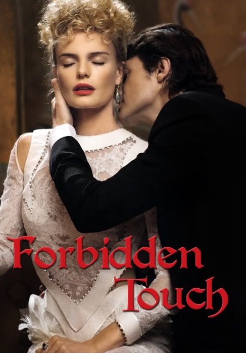
Amanda: This doesn't scream "romance" to me. I get the vibe from you that you want to punch him. You look like you're in pain. Your eyes may say one thing, but your lips say another - as does the way your right arm looks. I like how you added the title and I love the styling, but I just don't see that connection! I don't see any passion! I don't see any love! It's almost like he's forcing it, and the fact that we can hardly see him AND your eyes are closed... it's just hard to find a good focus. It doesn't grab my interest - it's good, it just isn't great.
Hayley: You definitely do seem disgusted by the man in the photo. At least you're the focus in this shot, though. My problem comes with the fact that this looks like a cover for a bad 80s romance novel. I don't like your dress, I'm ok with the makeup, but I HATE that hair. Maybe the hair is what's giving me the "bad 80s" vibe.
Natalie: Yeah... you don't seem to pleased by this man, so I think that's going to hurt. It really doesn't come across as romance to me. I also think the modelling aspects of this photo leave something to be desired.
Kirsten "I Think I Love You"

Adele: A for effort, A for the concept and overall, A from me. Great job, girl. You nailed it. The passion is there, I love the setting. Fantastic job, Kirsten!!!
Amanda: You worked hard on putting this together. I can tell. This is 100% a genuine romance cover. There's no mistaking it. If I saw it on display, I'd know exactly what it is, even without the title. This definitely seems like a "morning after" kind of photo, and you both realize you love each other after an intimate encounter. The guy is almost an afterthought, but you steal the show. You're hot. You're cute. You want him. He wants you. This is great. You are officially the girl to beat, Kirsten! Well done!
Hayley: I can tell you've put a lot of thought and a lot of work into this photo. The description you gave fits perfectly with the photo. She definitely does have that look on her face that says that she's seen this guy a thousand times before, but she's also seeing him for the first time. I like the styling and the setting, too. I just wish the picture quality was a bit better. It's not a bad quality, but I still feel it could have been better. Everything else is great, though.
Natalie: Like the judges said, putting effort into a photo helps. We love to know that you care. I think you did a great job with this. It fits the theme really really well, obviously, and your pose is really sexy and really intriguing. Great job with this!
Kristen "The Fire Within"

Adele: You look great, but it's a little bit boring for a Romance Cover. I want something spicier, the setting is unattractive for me. Last week, your setting really help you a lot. On the positive note, you look beautiful and confident here.
Amanda: No setting. No man. You need one of those. If it's you with your lover, I don't care if there's a setting or not - many romance covers don't have one if they have passion between the two central characters. But here, you're just a sexy woman. A very sexy woman. There's no denying that you're really pretty here, but you have almost no relation to the theme. I would never guess "romance" with this as your cover. This seems more... "biography." Your modelesquity and attractiveness will help you a lot, but the theme relation is something to worry about. A lot.
Hayley: When I saw this picture, I thought to myself "Is she going for a Pretty Woman type of feel or is she going for a Paris Hilton/Kim Kardashian feel with this photo?" Then I remembered that it's pretty much the same thing. Except the latter lacks substance. I agree with Amanda that a romance cover needs either a setting or a partnering on the cover or else it looks like it could be for a different style of book. However, I'm not going to say that your picture looks devoid of romance novel connection. It just isn't that strong this week. I do appreciate you giving us the exaggerated aspects of the photo that are in line with most romance novel covers, though. The windblown hair and the outfit really help you this week.
Natalie: I agree with the judges. This really needs a backstory or a man, and leaves something to be desired without either. I think that while this photo has strong modelling aspects, it just doesn't fit the theme well. Sorry!
Marion "My Week With Marion"
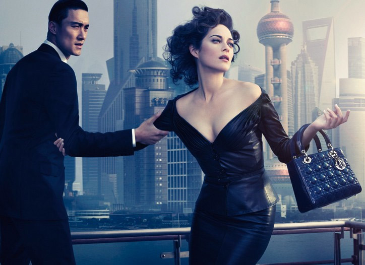
Marion: Love it. From the setting to your body language, Stunning!!! The styling is great. I love the concept and story behind this photo. Amazing week for you, Marion.
Amanda: I hate the title. I love everything else. The styling is good, and your selling is great. This is a very interesting idea. Falling in love on a business trip. Especially in a country like China. Amazing place (though I've never been to Shanghai). You do look stunning, even if you're not connecting to the camera (again) and it works this time - you sell your indecision well. The image is perfect for the concept. The title is not. As a writer, I sometimes struggle with titles, so I can see that you may have here. A few suggestions: "International Affair," "Digging to China," "Love the World Over," or "Commonism." But yeah, your weak title is my only issue. Well done!
Hayley: I'll forget I ever read that title because I don't want there to be a blemish on this photo in my memory. What a fantastic photo you have this week. It fits the theme perfectly and it fits the modeling aspect perfectly. I know I probably should say this next part since it's a dead giveaway as to where I'm ranking you, but if you do not get the FCO this week, there is something seriously wrong here.
Natalie: I, too, think this is a really solid job. There's definitely a story here, and it works because you look great.
Monica ""Untameable: A Tale of Tough Love"

Adele: There's a lack of passion for me between you and your man. I want more than this. I want it to be spicier and juicier!!! I want more emotion from you too. But you look beautiful here. I love the styling in the photo. Overall, it was just an okay photo for me
Amanda: The black and white is striking and, with colored text, could be REALLY striking. However, I must agree that there is no passion, no connection, no real love here, and you look sort of masculine. I do love your hair and the leather jacket is shiny and sexy, but your face is just... weak, especially your lips. His face is kind of funky too, to be honest. Don't worry - I don't hate this, but I don't love it either.
Hayley: Why do I think you two are just dance partners? The styling and posing works well for the theme this week, though. There could have been more passion coming from you two, but I still see some there. I do like that it's in black and white. I think it adds more character to this photo. Picturing it in color, I doubt it'd be better.
Natalie: I don't know how I feel about the black and white. You don't normally see that on a book cover, since those are meant to grab your eye. I also feel like you and the guy are sort of equals in this photo, and that doesn't help. Overall, it's just okay for me.
Penelope "Español Amante Seductora aka Spanish Seductive Lover"

Adele: I love the concept. Hot and sexy. I think it's such a great photo but I have a little problem trying to visualize this photo into a romance novel cover. That's my only issue. Other than that, I think this is such an amazing photo
Amanda: I don't like this, speaking from a thematic viewpoint; though the concept is incredible, it just doesn't seem romantic enough. I also don't like how my eyes are immediately glued to the toreador's cape. I then see the toreador himself, then the sky... oh and then you against the wall. That's a big issue here - I don't see you! Your dress is gorgeous, but you're not stealing the show with it like you should! I can see this as a romance novel cover, really, but... it's not strong. I don't see a connection! I don't see love! I just see... uh I don't even know what I'm talking about xD. Good photo, but you need to stand out more, and you need to have a connection here! It's sexy, but that's it.
Hayley: As just a photo for a romance novel cover, I actually really like this. However, I do have to be able to focus on you as a model and that's where we run into problems. The man in this photo does such a fantastic job and exudes such strength and presence, that it overshadows you. I do like your styling and for the story the picture is telling, your pose works well. It just doesn't work well from the modeling standpoint. I'd say good job on the theme, but the modeling needs to be picked up in the future.
Natalie: Again, I agree with the judges before me. This is damn near perfect in terms of the theme, however, you really are not much of a model here. You look great, but you're off to the side, involved in something else, and your eyes are closed. My attention goes to the red in the middle. Overall, an okay job.
Sophia "Forbidden Summer Night"

Amanda: This is good for a cover - but not great. It doesn't have the "pop" that it needs. It's something I will see and not be intrigued by it. I see romance. I see how this could be a lovin' scene. But I don't see much else. I don't see much modelesquity (that's referring to how much you look like a model) here. I just see a pretty couple making love. It's safe, it's generic, and it might be just enough to get you through to next round. But only barely. I want something more. I want something to make it stand out from the pack! This doesn't have that - it's not horrible, either, even if it is a screencap...
Hayley: Ok, this picture fits the theme fine enough. The romance is there, but as far as a cover for a romance novel, I think it could have been pushed a bit further. I have to agree with Amanda that the modeling is not at the level I would like it to be. While I have less of a problem with screencaps than most other judges (even though I don't think I've ever personally used one), you do have to keep in mind that an actual modeling picture will generally do much better in these games than any screencap. To me, screencaps are a last resort in case there's just absolutely nothing else that fits the theme or isn't God-awful. In the end, this is a step up from last week and the theme is fine, but the modeling aspect really needs to improve soon.
Adele: I can see the potential of the photo. The connection between you and your partner is great. It's very sensual and passionate but I agree with Amanda & Hayley. This photo is still lack of modelling value in it. Compared to your photo last week, this week is better.
Natalie: I think this is just okay for me. I mean, it fits the theme, but it's really not a modelling shot, and we're looking for that. Sorry!
Welcome to your Second Judging Session for this cycle. This week you need to submit a photo for a Romance Novel and also come with up with the title of your novel.
Let's see how you girls did this week
Ashley "What Love Is?"

Adele: Beautiful. I love the chemistry between you guys. I love the setting. Very romantic and loving. My only concern is Kellan kinda stole the limelight here from you a little bit but overall, I still think this is a lovely shoot, Ash
Amanda: Not so sure on your title. Your photo, however, is great - you two clearly are connecting AND it looks like a photoshoot. You're snuggling up to him, making him happy, and it's just wonderful. The styling is nothing special, but it doesn't need to be - you're two normal college students ready to get into something more serious. But... I really don't like how your eyes are closed, because this sort of makes him to be the protagonist, or rather, who I'd expect to be. It's a cute shoot, but you don't pop out at me like you could. Despite that, this is still quite strong, so good work Ash <3
Hayley: When I look at this photo, my eyes are drawn to the guy. He does strike me as the main subject of the photo and it's for the reason that Amanda has already listed: his eyes are open and your eyes aren't. That said, this is a nice photo for a romance novel. I love your styling in this and the only thing I would have liked better about this photo would have been you focusing on the camera while he focused on you. Instead, we get you focusing on him and he's focusing on the camera.
Natalie: I don't have much more to say here. You're obviously connected, but my attention also goes to the guy. Still, you did a good job. Open eyes and this would be a lot better!
Britney "The Rebel & The Seductress Housekeeper"

Adele: Wow, at the synopsis. I can imagine the whole story of that novel. Very sexy. Overall, it's an okay photo. But I want more from you. I'm not really feel the connection between you and Kevin. But I really the concept of your novel. Interesting.
Amanda: Your synopsis sells this book to me, and I'm glad you thought that out. Very good work there. Your photo, however, is a bit too much - the styling almost goes overboard, and though it is sexy, the cigarette he has is a bad thing. He doesn't seem as interested in you as you are in him. He's just like, "Yeah." to this whole thing. You do steal the spotlight, and although the photo is small, it still looks professional even with the punky styling. I happen to like it, but I don't love it - for reasons already mentioned. Good job.
Hayley: Your synopsis does do a good job selling the photo. It's still not my favorite, but it does help. This almost seems like a farcical romance novel. You being dressed up as a housekeeper works since that's a common recurring theme for a stereotypical male fantasy of a woman. However, K-Fed makes me not take this picture seriously and is a bit distracting. In the end, I like you in the photo.
Natalie: I think you did a really good job selling the book, and I love that. However, the cover itself comes across as a bit hoochie, and I feel like that doesn't represent you as well as it could in a modelling game. However, I still really like the storyline, so good job!!
Danielle "Remembering Samantha"

Amanda: You're about six hours past deadline, you realize. That's a lot more than 17 minutes, and that's going to cost you some points. Now, I do like this photo, but I don't see it as a romance cover. You're really sexy, but to be honest... you look kind of slutty. You don't look like you're interested in anything serious, anything long-term. Now I could see justification for a romance novel, but you didn't give it to us, so I'm forced to rely on my own English-major mind to come up with one. Given the unromantic setting - or rather, the lack of a partner to share this seclusion with - I'd say you might be at some state park looking for a big, gruff hiker dude to sleep with. You're looking for someone who isn't looking for you, and you're showing off your ass to passerby to hopefully get something in it. Yeah, this is R-rated. And it sounds cheesy. I do like how sexy you are, but I just don't know, and your lateness is pretty serious...
Hayley: I'll follow Amanda's lead in that I'l dock you a few points when I rank you, but not give you automatic last. This is a picture that a backstory probably could have helped. There seems to be a bit of a disconnect between your styling and the setting of the photo. I can see it working for the theme this week, though. Maybe the city girls falls for a country boy and it's a bit of a fish-out-of-water romance story. I like that we see a sexual side of you since that's often a good selling point for this type of novel.
Natalie: Yeah, I'm going to have to dock you for being 6 hours late as well. I'm sorry, but it's only fair. A backstory here could have helped, but it's also a tad unfortunate that you came after Britney, who wrote a wonderful backstory. This photo does have strong modelling aspects, so that'll help in the end. I namely like the shoes, pose, lipstick and hair.
Adele: Good photo. But your ranking this week definitely will be affected by your lateness. I love the setting. Not really a fan of the lighting. I love your look in this photo. Very edgy.
Dita "The Succubus"

Adele: This is definitely your niche. You look hot and sensual. I can see this photo as a cover for romance novel. I really like the angle of the photo. Good job, Dita.
Amanda: I see the relation to the other one you posted. Very nice. This is just as good as that one is - it's not the greatest cover ever or anything, but it's something eye-catching. Definitely getting hot in here. The setting is fantastic, the styling is good, though what the hell are those black dots? There's one below your chin and another near your eyebrow. Oh wait the second one is a mole, my error. I really do like this, and it fits nicely. Good work!
Hayley: I'd be very disappointed in you if you didn't do well this week. This absolutely works for a romance novel. The styling and posing is fantastic and there's very little to complain about. My only actual complaint is that towards your legs, the photo seems to get a bit blurry. Not that bad, but the quality of the picture isn't 100% spot on. Otherwise, I really like what you've done this week.
Natalie: I, too, really like this. I do think this is your niche and I think you did a strong job. The modelling aspects are strong, and the cover is a nice touch. I really don't have anything bad to say about this!
Eliza "The Other Side of the Bed"

Adele: You look very beautiful. I love your hair in this photo. Sexy. The concept is simple but it worked out well for you. The strongest element in this photo is your emotion. I can feel it.
Amanda: I love this. I really, really love this. You look so vulnerable and worried, yet you have that lust. I connect to you a LOT here. I love your hair, the styling, and the setting is spectacular. Crop it a bit and you've definitely got yourself a real romance cover - something I'd be interested in looking at. This is definitely an improvement over last round. Great work

Hayley: A lot stronger than your previous photo. This photo has much better clarity and you look beautiful in it. I like the vulnerability you exude in this photo since it suggests the story will be emotionally charged. A great cover can tell you what the story is without any words. This is one of those covers.
Natalie: I love this, Eliza! The emotion, the clothing, the setting... all of it. Great work!
Emilia "The Velvet Affair"

Natalie: This is pretty good, Emilia. I like your pose, look, setting and showing of your leg. I think all of that comes together quite nicely. I am not a huge fan of that dress/robe of sorts, just because I think it's a little bright, and there's a lot of contrast from it to the chair, and somewhat detracts the focus from you. I still think that you, overall, did a good job.
Adele: I love your hand gesture in this photo. Another solid photo from you. I love the styling. Very sexy. I totally can see this photo as a cover for the romance novel. Beautiful
Amanda: You look like a rich woman, bored and lonely, seeking a lover - so I could definitely see how this could be justified as a romance cover. I, however, am with Natalie - the robe is almost overwhelmingly bright, and the low resolution of the photo makes it even worse. I also don't like your overdone eye makeup - that contrasts too much with the robe. Your expression is also kind of weak, but your eyes are naturally baggy... so I see that becoming a recurring problem. Don't get me wrong - this is good, it just isn't the one I'm going to pick up and page-turn at a bookstore.
Hayley: You look high. I would have preferred to have seen your robe is a slightly darker color because it is too bright. However, the pose and the setting both work nicely for this photo. I like that you're showing some leg, too. It's sexual without getting vulgar.
"African Skies: The Untold Love Story"

Natalie: This is really, really strong. I can see this on display at Barnes and Noble [RIP Borders
 ]. I think that there's strength in this with your look, and the setting of the sky. I also really like your style and pose; however, I wish that I could see a bit more of that rock on which you're leaning. That's my only real critique with this. Great job!
Adele: You look hot and sexy. I still think last week photo was stronger than this week. It was just okay for me this week. I want it to be more spicy and sensual. But once again, I love your eye contact with the camera.
Amanda: Your description makes this sound more like an adventure novel, given that it's set in Africa. You're looking for your African prince but don't find him until later and you have to go through hardships and poverty and... yeah. I'm not sure how it fits. Still, your photo is gorgeous. Love the pose. The expression sucks me in and shows a yearning, something you will do anything to get, and your hair is great. I prefer this to last week's, though I did hate your photo last round, but I don't completely see the connection to the theme even IF this is a VERY good book cover for a great idea that I might even read. It just doesn't scream "romance."
Hayley: I'm not a fan of your description, so I'm going to pretend like I didn't read it and I'll critique this based off of the story I get from the picture. I love your pose in this picture. It's a very flirtatious/seductive pose. Well, at least for someone who's standing up. The confidence you exude in the picture is fantastic and I could see this working well as a cover. Just for a more urban environment than Africa. I don't see her going on an adventure in this outfit with that styling and makeup.
Kate "Forbidden Touch"

Amanda: This doesn't scream "romance" to me. I get the vibe from you that you want to punch him. You look like you're in pain. Your eyes may say one thing, but your lips say another - as does the way your right arm looks. I like how you added the title and I love the styling, but I just don't see that connection! I don't see any passion! I don't see any love! It's almost like he's forcing it, and the fact that we can hardly see him AND your eyes are closed... it's just hard to find a good focus. It doesn't grab my interest - it's good, it just isn't great.
Hayley: You definitely do seem disgusted by the man in the photo. At least you're the focus in this shot, though. My problem comes with the fact that this looks like a cover for a bad 80s romance novel. I don't like your dress, I'm ok with the makeup, but I HATE that hair. Maybe the hair is what's giving me the "bad 80s" vibe.
Natalie: Yeah... you don't seem to pleased by this man, so I think that's going to hurt. It really doesn't come across as romance to me. I also think the modelling aspects of this photo leave something to be desired.
Kirsten "I Think I Love You"

Adele: A for effort, A for the concept and overall, A from me. Great job, girl. You nailed it. The passion is there, I love the setting. Fantastic job, Kirsten!!!
Amanda: You worked hard on putting this together. I can tell. This is 100% a genuine romance cover. There's no mistaking it. If I saw it on display, I'd know exactly what it is, even without the title. This definitely seems like a "morning after" kind of photo, and you both realize you love each other after an intimate encounter. The guy is almost an afterthought, but you steal the show. You're hot. You're cute. You want him. He wants you. This is great. You are officially the girl to beat, Kirsten! Well done!
Hayley: I can tell you've put a lot of thought and a lot of work into this photo. The description you gave fits perfectly with the photo. She definitely does have that look on her face that says that she's seen this guy a thousand times before, but she's also seeing him for the first time. I like the styling and the setting, too. I just wish the picture quality was a bit better. It's not a bad quality, but I still feel it could have been better. Everything else is great, though.
Natalie: Like the judges said, putting effort into a photo helps. We love to know that you care. I think you did a great job with this. It fits the theme really really well, obviously, and your pose is really sexy and really intriguing. Great job with this!
Kristen "The Fire Within"

Adele: You look great, but it's a little bit boring for a Romance Cover. I want something spicier, the setting is unattractive for me. Last week, your setting really help you a lot. On the positive note, you look beautiful and confident here.
Amanda: No setting. No man. You need one of those. If it's you with your lover, I don't care if there's a setting or not - many romance covers don't have one if they have passion between the two central characters. But here, you're just a sexy woman. A very sexy woman. There's no denying that you're really pretty here, but you have almost no relation to the theme. I would never guess "romance" with this as your cover. This seems more... "biography." Your modelesquity and attractiveness will help you a lot, but the theme relation is something to worry about. A lot.
Hayley: When I saw this picture, I thought to myself "Is she going for a Pretty Woman type of feel or is she going for a Paris Hilton/Kim Kardashian feel with this photo?" Then I remembered that it's pretty much the same thing. Except the latter lacks substance. I agree with Amanda that a romance cover needs either a setting or a partnering on the cover or else it looks like it could be for a different style of book. However, I'm not going to say that your picture looks devoid of romance novel connection. It just isn't that strong this week. I do appreciate you giving us the exaggerated aspects of the photo that are in line with most romance novel covers, though. The windblown hair and the outfit really help you this week.
Natalie: I agree with the judges. This really needs a backstory or a man, and leaves something to be desired without either. I think that while this photo has strong modelling aspects, it just doesn't fit the theme well. Sorry!
Marion "My Week With Marion"

Marion: Love it. From the setting to your body language, Stunning!!! The styling is great. I love the concept and story behind this photo. Amazing week for you, Marion.
Amanda: I hate the title. I love everything else. The styling is good, and your selling is great. This is a very interesting idea. Falling in love on a business trip. Especially in a country like China. Amazing place (though I've never been to Shanghai). You do look stunning, even if you're not connecting to the camera (again) and it works this time - you sell your indecision well. The image is perfect for the concept. The title is not. As a writer, I sometimes struggle with titles, so I can see that you may have here. A few suggestions: "International Affair," "Digging to China," "Love the World Over," or "Commonism." But yeah, your weak title is my only issue. Well done!
Hayley: I'll forget I ever read that title because I don't want there to be a blemish on this photo in my memory. What a fantastic photo you have this week. It fits the theme perfectly and it fits the modeling aspect perfectly. I know I probably should say this next part since it's a dead giveaway as to where I'm ranking you, but if you do not get the FCO this week, there is something seriously wrong here.
Natalie: I, too, think this is a really solid job. There's definitely a story here, and it works because you look great.

Monica ""Untameable: A Tale of Tough Love"

Adele: There's a lack of passion for me between you and your man. I want more than this. I want it to be spicier and juicier!!! I want more emotion from you too. But you look beautiful here. I love the styling in the photo. Overall, it was just an okay photo for me
Amanda: The black and white is striking and, with colored text, could be REALLY striking. However, I must agree that there is no passion, no connection, no real love here, and you look sort of masculine. I do love your hair and the leather jacket is shiny and sexy, but your face is just... weak, especially your lips. His face is kind of funky too, to be honest. Don't worry - I don't hate this, but I don't love it either.
Hayley: Why do I think you two are just dance partners? The styling and posing works well for the theme this week, though. There could have been more passion coming from you two, but I still see some there. I do like that it's in black and white. I think it adds more character to this photo. Picturing it in color, I doubt it'd be better.
Natalie: I don't know how I feel about the black and white. You don't normally see that on a book cover, since those are meant to grab your eye. I also feel like you and the guy are sort of equals in this photo, and that doesn't help. Overall, it's just okay for me.
Penelope "Español Amante Seductora aka Spanish Seductive Lover"

Adele: I love the concept. Hot and sexy. I think it's such a great photo but I have a little problem trying to visualize this photo into a romance novel cover. That's my only issue. Other than that, I think this is such an amazing photo
Amanda: I don't like this, speaking from a thematic viewpoint; though the concept is incredible, it just doesn't seem romantic enough. I also don't like how my eyes are immediately glued to the toreador's cape. I then see the toreador himself, then the sky... oh and then you against the wall. That's a big issue here - I don't see you! Your dress is gorgeous, but you're not stealing the show with it like you should! I can see this as a romance novel cover, really, but... it's not strong. I don't see a connection! I don't see love! I just see... uh I don't even know what I'm talking about xD. Good photo, but you need to stand out more, and you need to have a connection here! It's sexy, but that's it.
Hayley: As just a photo for a romance novel cover, I actually really like this. However, I do have to be able to focus on you as a model and that's where we run into problems. The man in this photo does such a fantastic job and exudes such strength and presence, that it overshadows you. I do like your styling and for the story the picture is telling, your pose works well. It just doesn't work well from the modeling standpoint. I'd say good job on the theme, but the modeling needs to be picked up in the future.
Natalie: Again, I agree with the judges before me. This is damn near perfect in terms of the theme, however, you really are not much of a model here. You look great, but you're off to the side, involved in something else, and your eyes are closed. My attention goes to the red in the middle. Overall, an okay job.
Sophia "Forbidden Summer Night"

Amanda: This is good for a cover - but not great. It doesn't have the "pop" that it needs. It's something I will see and not be intrigued by it. I see romance. I see how this could be a lovin' scene. But I don't see much else. I don't see much modelesquity (that's referring to how much you look like a model) here. I just see a pretty couple making love. It's safe, it's generic, and it might be just enough to get you through to next round. But only barely. I want something more. I want something to make it stand out from the pack! This doesn't have that - it's not horrible, either, even if it is a screencap...
Hayley: Ok, this picture fits the theme fine enough. The romance is there, but as far as a cover for a romance novel, I think it could have been pushed a bit further. I have to agree with Amanda that the modeling is not at the level I would like it to be. While I have less of a problem with screencaps than most other judges (even though I don't think I've ever personally used one), you do have to keep in mind that an actual modeling picture will generally do much better in these games than any screencap. To me, screencaps are a last resort in case there's just absolutely nothing else that fits the theme or isn't God-awful. In the end, this is a step up from last week and the theme is fine, but the modeling aspect really needs to improve soon.
Adele: I can see the potential of the photo. The connection between you and your partner is great. It's very sensual and passionate but I agree with Amanda & Hayley. This photo is still lack of modelling value in it. Compared to your photo last week, this week is better.
Natalie: I think this is just okay for me. I mean, it fits the theme, but it's really not a modelling shot, and we're looking for that. Sorry!

