Post by Amanda Kimmel on May 5, 2012 13:09:33 GMT -5
Amanda here with results!
This week, five of you were tasked to model hats, and five of you were tasked to model shoes. Let's see what myself, Hayley, and Natalie had to say about all of you!
Amanda: I really don't know how I feel about dark hair on you. Or this look. I LOVE your legs. I LOVE the idea, but the quality is somewhat low. It's badass, but I don't know how YOU it is. And like you said, the hat isn't the most flattering - that's a problem when the THEME is hats. You need to be SELLING that hat, not just WEARING it. You're only wearing it. You are sexy and fierce, but in a bit too of a gothic, grungy way that doesn't totally suit you. Your lips are also... weak. Don't know what it is. This is just... okay, sorry Brit :/
Natalie: This is average for me, and I'll explain why. You took a risk, which I like, but it worked in some ways and it didn't in others. I think you look badass here, and I like it. I love your legs, but this is about a hat. The hat is sort of ugly, to be honest. YOU look great, but the hat is meh. I commend you for taking a risk, and encourage you to take more, but this is just an okay photo for me overall.
Hayley: I notice the hat first, the horrible facial expression second, and the bike third. So, hat being noticeable, good theme incorporation. As far as the hat possibly looking ugly, I'm fine with it. That hat fits the styling of the shoot. The type of woman you are portraying in this photo is the type of woman who would wear that hat. The badass biker chick isn't going to wear a pink, feathery hat. I really do hate the expression on your face in this shoot, though. Also, with how dark it is in the shoot, I have trouble telling exactly where your arms are in the picture. It tends to blend in with the rest of the photo too much.
Amanda: Dark, yeah... a bit too dark. I do like the hat and the antiquated theme and it's really... morbid. I'm not sure about those gloves, as they don't seem to fit, and although your face is great, I'm not completely sold on the veil - especially given the way the lighting already is. You do sell the hat well, and this is overall good, there's just nothing that makes this "pop" for me. Again, that may be due to the lighting. Still, this is a major improvement from last week, so good job
Natalie: Ah, I like this. The veil draws your eyes up to the hat and makes you really look at it. It makes you question what exactly it is. I think you sold the hat well, and the outfit compliments it greatly. Impressed with you this week, Jennifer!
Hayley: I like how you went a different route with this picture. I like it and I definitely don't have a problem with veils since we can still see your face perfectly fine. I am going to have to echo the other judges' sentiment that I hate those gloves, though. They look like gloves you'd wear if you were trying to dispose of the body in vats of acid. Other than that, I really like what you've done this round.
Amanda: I love the color combo here. Your eyes are FIERCE and the colors really help. Although I'm not overly fond of the studio shoot, this one works because it makes you POP, and it makes the hat pop too. You're selling the hat, you're modeling the hat, and you're owning it - you're sexy, you're fierce, and you're a model. I don't completely like the red thing you're wearing, but it works. Overall, fantastic work once again Kate! You are definitely one of the girls to beat!
Natalie: I think this is a job well done, though I wish you were wearing a cooler color. Red is just so dominant, that it takes away from the hat. I'm also not a huge fan of plain studio shots, but I think you overall did a respectable job.
Hayley: This studio shot is fine because everything else in the photo just pops so well that it prevents a dull background from taking away from the picture. Your eyes are stunning in this photo and I've never noticed how bright they were before. The hat, while prominent, is not the main focus of the picture, so that's the only negative I have for you. However, your pose does help lead my eyes to notice the hat quicker than I probably would have had your hands not been touching it. Another strong week for you.
Amanda: I like it, but I don't love it. It's playful, it's sweet, it's sophisticated, but it's also older, and from what I can see of your face, somewhat snobby. You look like a wealthy woman. I like that, but I don't. I like the idea, but the execution is just okay. Maybe your hair needs to be a bit straighter and longer - maybe that's what's giving me the vibe. I like the hat, and you are selling it even if you are covering yourself with it. Overall, it's definitely good. Keep it up!
Natalie: The hat is definitely noticeable here, and that's because it's covering part of your face. That's good and bad, but it ultimately works for the hat. I don't love this as a modelling shot, but I think it's a pretty decent job all things considered. Nice work!
Hayley: The last time you had a floppy hat that covered half your face, I hated it and I think I ranked you pretty low. However, this "floppy hat covering half the face" shot is much better. The hat is your task for the week and it's very noticeable. I also like this as a modeling shot, so it works on both levels. Not the best photo we've seen in the competition, but it's a good one and I doubt you have anything to worry about this week.
Amanda: What is that? It's like you're wearing some sort of swirl brownie on your head. I don't even see how it's attached to you - maybe it's a pillow you're balancing? It's very... unique, though, and I dare say I do love the risk-taking. The black and white helps more than it hurts, and it's definitely a strong artistic shot. I adore the setting and adore how you command it and look graceful, but I'm going to remember this more for how it confused me than anything. But hey, look at the bright side - it's memorable, which is spectacular. Well done, Mo!
Natalie: Wow, once again I think you've done a great job. I know you've been counting yourself out, but you shouldn't. This is once again a great photo, and I've ranked you first before. The hat matches your outfit well, and is certainly noticeable. Great job this week!
Hayley: I tend to like black and white shots, but this is a time that I'm envisioning it in color and think that it probably would have been better that way. However, I still really like this shot. Looks very high fashion. While there is a lot going on in the photo, my eyes are still drawn to the hat first, so none of the rest of the stuff takes away from the what should be the focus this round. The swirl stuff around your breasts looks kind of awkward to me, but overall, I still really like this shot.
Amanda: I must say I love your shoes. They're great, they're high, they're sexy. However, I don't really see how they POP here. Your legs are amazing and sort of steal the focus. A lot of things about this remind me of Katie's shoe photo last season - it's safe, it's not bad, it's pretty, but it isn't a knockout punch. Perhaps more colorful shoes could have made them POP the way I want them to! I doubt you'll be in trouble though
Natalie: I agree with Amanda for the most part. The shoes aren't the most focal thing here, but I think it's a pretty decent job. Will you be remembered for this shot? Most likely not. Will you be safe? Most likely. I do like your pose, btw.
Hayley: I do notice the shoes fairly early on this in this photo. You look stunningly beautiful in this photo and I like it more than I've liked most of the photos you've submitted so far in the competition. The styling is great, the pose is great, and the theme incorporation is fine. That's actually probably the weakest part of a very strong photo, so it's nothing to worry about cause it's still good.
Amanda: This is... unique. There was definitely some hardcore Photoshopping done here. Not by you, most likely - it looks really professional. You look like a plastic doll. That... I do not like. I also don't like that your dress is redder than your shoes, because you need to be selling them. A darker dress would make the shoes stand out more. This is high-fashion and I do love your shoes, but this isn't selling them. This is like a circus ad. It reminds me of something weird from Zoe last cycle... and I think I don't like this for the same reason as I didn't like that. I don't HATE this, it's just... weird. For a lot of reasons. Not having a description hurts, though :/
Natalie: I don't think it's as weird or as circus-y as Amanda, but I do have a problem with it. Nothing differentiates the shoes from the dress. It almost looks like they're made from the same fabric. You also don't look super real... Katy Perry-esque? This is just okay for me, because while the shoes are definitely something you see, the dress is problematic.
Hayley: I like how this picture is completely desaturated with the exception of the red in the photo. It makes your dress, lips, and shoes really pop. My attention does go to the dress first, but the shoes are noticeable shortly after that. I'm not a big fan of your posing or facial expressions in this shoot, though. I think this might actually be the weakest photo you've submitted so far in the competition, but when you've had as many good ones as you've had, you're bound to have a "personal weakest" at some point.
Amanda: Maybe you should have gone with hats, then? Regardless, I LOVE THE GUN. But... at the same time, it's a gun. It catches your attention. The shoes don't. You need to SELL the shoes. Now, you definitely are sexy here, and I totally feel the model vibe, and the unique concept here will win you a few points. In the end, though, with the theme being the shoes, I can't say this is any more than average. Sorry :/
Natalie: This may be a recurring problem. A lot of you guys are posting great shots, but not really nailing the theme. That's about it here. I love everything about this, but it's not promoting your shoes. You'll lose points there, but it's still a shot I really like.
Hayley: I like this from a modeling standpoint, but the shoes do seem like a bit of an afterthought in this; especially since there's a shadow cast over them and they're already a dark color to begin with. Also, your feet/ankles don't look all that appealing since they look dirty/damaged. The shoes are still somewhat noticeable, so the theme incorporation is still there, but what will possibly save you this week is the modeling aspect of the photo. That part is very strong.
Amanda: I really dislike your hair here. It's a bit too short, and the way it covers your eye doesn't suit you. However, you are DEFINITELY selling the shoes. They're dark, and the black-and-white definitely helps them pop. I like the risk, I like the different approach, and the confusing angulation of the room is definitely a plus. Overall, this is good - I just wish I liked your hair more like this. That's really my only quibble, otherwise you've once again pleased someone who isn't easy to please
Natalie: This is sort of the opposite from everyone else. I really dislike this as a modelling shot, but I think you nailed the theme. I don't really like your expression, the bra strap, or your haircut. I do, however, notice the shoes and that's gonna help.
Hayley: I'm going to have to mainly agree with Amanda. I like this shot even if I'm not crazy about your hair. The shoes work well and I'm beginning to believe that a successful shoe shot is harder to pull off than a successful hat shot. I'm fine with your expression since it fits with the styling and the vibe of the photo. I'm also fine with the bra strap showing since it also fits with the vibe of the photo. Once again, not your strongest photo, but it's going to be hard for you to live up to the standard you have already set for yourself in this competition. Still a strong showing from you, though.
Amanda: I love the shoes, but I hardly notice them. This seems to be a trend... and for you, it's because of your dress. The dress is gorgeous. The styling is impeccable. It just isn't selling the SHOES. Hayley isn't going to like it for that, but I will say that I do, in fact, like this. You're a model, you're hot, your face is unique and genuine, and there really isn't anything bad to say about the photo itself. The relation to the theme, however, could definitely be stronger. That's really my only complaint!
Natalie: I agree with Amanda- your theme is weak, but your modelling is strong. I also think that if your dress was another color, it could help. Red is very dominant, so it takes a lot of attention. I also like the story created by your setting's contrast to your dress.
Hayley: This looks like an outtake from a modeling shoot, but maybe that was what they were going for when they took this shot. The theme is present, but could have been better represented. I like the overall styling for the shoot, but would have preferred it if the shoes were a more noticeable color since my eyes are not drawn to them first.
This week, five of you were tasked to model hats, and five of you were tasked to model shoes. Let's see what myself, Hayley, and Natalie had to say about all of you!
HATS
BRITNEY

BRITNEY

Amanda: I really don't know how I feel about dark hair on you. Or this look. I LOVE your legs. I LOVE the idea, but the quality is somewhat low. It's badass, but I don't know how YOU it is. And like you said, the hat isn't the most flattering - that's a problem when the THEME is hats. You need to be SELLING that hat, not just WEARING it. You're only wearing it. You are sexy and fierce, but in a bit too of a gothic, grungy way that doesn't totally suit you. Your lips are also... weak. Don't know what it is. This is just... okay, sorry Brit :/
Natalie: This is average for me, and I'll explain why. You took a risk, which I like, but it worked in some ways and it didn't in others. I think you look badass here, and I like it. I love your legs, but this is about a hat. The hat is sort of ugly, to be honest. YOU look great, but the hat is meh. I commend you for taking a risk, and encourage you to take more, but this is just an okay photo for me overall.
Hayley: I notice the hat first, the horrible facial expression second, and the bike third. So, hat being noticeable, good theme incorporation. As far as the hat possibly looking ugly, I'm fine with it. That hat fits the styling of the shoot. The type of woman you are portraying in this photo is the type of woman who would wear that hat. The badass biker chick isn't going to wear a pink, feathery hat. I really do hate the expression on your face in this shoot, though. Also, with how dark it is in the shoot, I have trouble telling exactly where your arms are in the picture. It tends to blend in with the rest of the photo too much.
JENNIFER
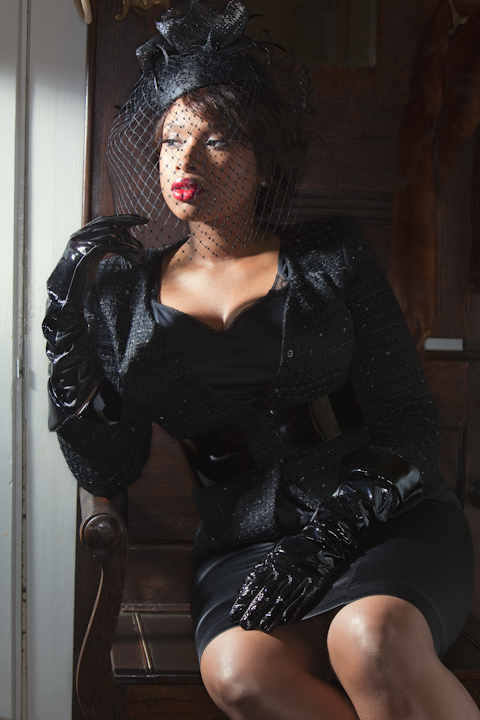

Amanda: Dark, yeah... a bit too dark. I do like the hat and the antiquated theme and it's really... morbid. I'm not sure about those gloves, as they don't seem to fit, and although your face is great, I'm not completely sold on the veil - especially given the way the lighting already is. You do sell the hat well, and this is overall good, there's just nothing that makes this "pop" for me. Again, that may be due to the lighting. Still, this is a major improvement from last week, so good job
Natalie: Ah, I like this. The veil draws your eyes up to the hat and makes you really look at it. It makes you question what exactly it is. I think you sold the hat well, and the outfit compliments it greatly. Impressed with you this week, Jennifer!
Hayley: I like how you went a different route with this picture. I like it and I definitely don't have a problem with veils since we can still see your face perfectly fine. I am going to have to echo the other judges' sentiment that I hate those gloves, though. They look like gloves you'd wear if you were trying to dispose of the body in vats of acid. Other than that, I really like what you've done this round.
KATE
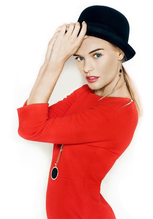

Amanda: I love the color combo here. Your eyes are FIERCE and the colors really help. Although I'm not overly fond of the studio shoot, this one works because it makes you POP, and it makes the hat pop too. You're selling the hat, you're modeling the hat, and you're owning it - you're sexy, you're fierce, and you're a model. I don't completely like the red thing you're wearing, but it works. Overall, fantastic work once again Kate! You are definitely one of the girls to beat!
Natalie: I think this is a job well done, though I wish you were wearing a cooler color. Red is just so dominant, that it takes away from the hat. I'm also not a huge fan of plain studio shots, but I think you overall did a respectable job.
Hayley: This studio shot is fine because everything else in the photo just pops so well that it prevents a dull background from taking away from the picture. Your eyes are stunning in this photo and I've never noticed how bright they were before. The hat, while prominent, is not the main focus of the picture, so that's the only negative I have for you. However, your pose does help lead my eyes to notice the hat quicker than I probably would have had your hands not been touching it. Another strong week for you.
KRISTEN


Amanda: I like it, but I don't love it. It's playful, it's sweet, it's sophisticated, but it's also older, and from what I can see of your face, somewhat snobby. You look like a wealthy woman. I like that, but I don't. I like the idea, but the execution is just okay. Maybe your hair needs to be a bit straighter and longer - maybe that's what's giving me the vibe. I like the hat, and you are selling it even if you are covering yourself with it. Overall, it's definitely good. Keep it up!

Natalie: The hat is definitely noticeable here, and that's because it's covering part of your face. That's good and bad, but it ultimately works for the hat. I don't love this as a modelling shot, but I think it's a pretty decent job all things considered. Nice work!
Hayley: The last time you had a floppy hat that covered half your face, I hated it and I think I ranked you pretty low. However, this "floppy hat covering half the face" shot is much better. The hat is your task for the week and it's very noticeable. I also like this as a modeling shot, so it works on both levels. Not the best photo we've seen in the competition, but it's a good one and I doubt you have anything to worry about this week.
MONICA


Amanda: What is that? It's like you're wearing some sort of swirl brownie on your head. I don't even see how it's attached to you - maybe it's a pillow you're balancing? It's very... unique, though, and I dare say I do love the risk-taking. The black and white helps more than it hurts, and it's definitely a strong artistic shot. I adore the setting and adore how you command it and look graceful, but I'm going to remember this more for how it confused me than anything. But hey, look at the bright side - it's memorable, which is spectacular. Well done, Mo!

Natalie: Wow, once again I think you've done a great job. I know you've been counting yourself out, but you shouldn't. This is once again a great photo, and I've ranked you first before. The hat matches your outfit well, and is certainly noticeable. Great job this week!
Hayley: I tend to like black and white shots, but this is a time that I'm envisioning it in color and think that it probably would have been better that way. However, I still really like this shot. Looks very high fashion. While there is a lot going on in the photo, my eyes are still drawn to the hat first, so none of the rest of the stuff takes away from the what should be the focus this round. The swirl stuff around your breasts looks kind of awkward to me, but overall, I still really like this shot.
~~~~~~~~~~~~~~~~
SHOES
ASHLEY

ASHLEY

Amanda: I must say I love your shoes. They're great, they're high, they're sexy. However, I don't really see how they POP here. Your legs are amazing and sort of steal the focus. A lot of things about this remind me of Katie's shoe photo last season - it's safe, it's not bad, it's pretty, but it isn't a knockout punch. Perhaps more colorful shoes could have made them POP the way I want them to! I doubt you'll be in trouble though

Natalie: I agree with Amanda for the most part. The shoes aren't the most focal thing here, but I think it's a pretty decent job. Will you be remembered for this shot? Most likely not. Will you be safe? Most likely. I do like your pose, btw.
Hayley: I do notice the shoes fairly early on this in this photo. You look stunningly beautiful in this photo and I like it more than I've liked most of the photos you've submitted so far in the competition. The styling is great, the pose is great, and the theme incorporation is fine. That's actually probably the weakest part of a very strong photo, so it's nothing to worry about cause it's still good.
DITA


Amanda: This is... unique. There was definitely some hardcore Photoshopping done here. Not by you, most likely - it looks really professional. You look like a plastic doll. That... I do not like. I also don't like that your dress is redder than your shoes, because you need to be selling them. A darker dress would make the shoes stand out more. This is high-fashion and I do love your shoes, but this isn't selling them. This is like a circus ad. It reminds me of something weird from Zoe last cycle... and I think I don't like this for the same reason as I didn't like that. I don't HATE this, it's just... weird. For a lot of reasons. Not having a description hurts, though :/
Natalie: I don't think it's as weird or as circus-y as Amanda, but I do have a problem with it. Nothing differentiates the shoes from the dress. It almost looks like they're made from the same fabric. You also don't look super real... Katy Perry-esque? This is just okay for me, because while the shoes are definitely something you see, the dress is problematic.
Hayley: I like how this picture is completely desaturated with the exception of the red in the photo. It makes your dress, lips, and shoes really pop. My attention does go to the dress first, but the shoes are noticeable shortly after that. I'm not a big fan of your posing or facial expressions in this shoot, though. I think this might actually be the weakest photo you've submitted so far in the competition, but when you've had as many good ones as you've had, you're bound to have a "personal weakest" at some point.
ELIZA


Amanda: Maybe you should have gone with hats, then? Regardless, I LOVE THE GUN. But... at the same time, it's a gun. It catches your attention. The shoes don't. You need to SELL the shoes. Now, you definitely are sexy here, and I totally feel the model vibe, and the unique concept here will win you a few points. In the end, though, with the theme being the shoes, I can't say this is any more than average. Sorry :/
Natalie: This may be a recurring problem. A lot of you guys are posting great shots, but not really nailing the theme. That's about it here. I love everything about this, but it's not promoting your shoes. You'll lose points there, but it's still a shot I really like.
Hayley: I like this from a modeling standpoint, but the shoes do seem like a bit of an afterthought in this; especially since there's a shadow cast over them and they're already a dark color to begin with. Also, your feet/ankles don't look all that appealing since they look dirty/damaged. The shoes are still somewhat noticeable, so the theme incorporation is still there, but what will possibly save you this week is the modeling aspect of the photo. That part is very strong.
KIRSTEN


Amanda: I really dislike your hair here. It's a bit too short, and the way it covers your eye doesn't suit you. However, you are DEFINITELY selling the shoes. They're dark, and the black-and-white definitely helps them pop. I like the risk, I like the different approach, and the confusing angulation of the room is definitely a plus. Overall, this is good - I just wish I liked your hair more like this. That's really my only quibble, otherwise you've once again pleased someone who isn't easy to please

Natalie: This is sort of the opposite from everyone else. I really dislike this as a modelling shot, but I think you nailed the theme. I don't really like your expression, the bra strap, or your haircut. I do, however, notice the shoes and that's gonna help.
Hayley: I'm going to have to mainly agree with Amanda. I like this shot even if I'm not crazy about your hair. The shoes work well and I'm beginning to believe that a successful shoe shot is harder to pull off than a successful hat shot. I'm fine with your expression since it fits with the styling and the vibe of the photo. I'm also fine with the bra strap showing since it also fits with the vibe of the photo. Once again, not your strongest photo, but it's going to be hard for you to live up to the standard you have already set for yourself in this competition. Still a strong showing from you, though.
MARION


Amanda: I love the shoes, but I hardly notice them. This seems to be a trend... and for you, it's because of your dress. The dress is gorgeous. The styling is impeccable. It just isn't selling the SHOES. Hayley isn't going to like it for that, but I will say that I do, in fact, like this. You're a model, you're hot, your face is unique and genuine, and there really isn't anything bad to say about the photo itself. The relation to the theme, however, could definitely be stronger. That's really my only complaint!
Natalie: I agree with Amanda- your theme is weak, but your modelling is strong. I also think that if your dress was another color, it could help. Red is very dominant, so it takes a lot of attention. I also like the story created by your setting's contrast to your dress.
Hayley: This looks like an outtake from a modeling shoot, but maybe that was what they were going for when they took this shot. The theme is present, but could have been better represented. I like the overall styling for the shoot, but would have preferred it if the shoes were a more noticeable color since my eyes are not drawn to them first.


