Post by Adele on Apr 25, 2012 5:12:41 GMT -5
Hello Girls!!!
Welcome to your Third Judging Session. This week you need to submit a photo for Magazine Cover or Spread for your celebrity.
Let's start our judging session for this week

Natalie: This is just okay for me. It's nice, but not much about it really sticks out, nor do I dislike that much about it. I like you dress, but I wish you were a bit more smiley. That's about all! Good job.
Adele: Nice photo, I like the styling. The color of the magazine is a little bit off for me. It make the magazine unappealing for me. The pose a little bit stuff. You need to work hard on that.
Amanda: I find your facial expression to be somewhat weak, and because of it you look older than you actually are. I can't decide if this is a good or bad thing because you're freaking beautiful, yet you're not completely memorable. This just sticks into a sea of other commercial covers. Nothing about it catches my eye... except for the fact that this is a cover from the Baltic (Latvia, specifically). That's the most unique thing about this and that isn't the unique thing you want to have. The pose is good, but typical. Like Natalie, I like it, but I'm not going to remember it. That's plenty to get you to next round, so worry not
Hayley: I'm going to have to echo the "not memorable" sentiment. There's a little something off-putting about your facial expression, but it doesn't sink the photo. It works. In the end, if I had to describe this cover in one word, it'd be "Safe".

Natalie: Oh boy... I am not sure about this. The yellow is really, really overbearing. You look nice, and it's definitely a high fashion risk, but we'll have to see how it compares to the others. Part of me likes the yellow, and part of me doesn't.
Adele: Brit, that was too yellow.. I think you face look strong and you look confident in the photo but the whole concept is a little bit too much for me.
Amanda: I see this cover and I can say this: I'm definitely going to remember it. Is that a good thing? Not exactly. I'm going to remember it for being canary rather than remembering YOU. It's a great artistic cover, but it needs to be toned down. Dakota's V cover was toned down somewhat from its original, and this needs a similar touch-up. I like the high-fashion risk and it's very striking, but it's not because of you. You're covered in yellow mud and become an afterthought. I'm starting to sound like a broken record... xD. I do like this, it's just a bit too in-your-face. Like I said: Just tone it down a little! Play with the brightness and you've got yourself something amazing.
Hayley: The level of yellow in this photo oddly doesn't bother me. I actually like it. I love this cover because of how artistic it feels. It's strange because normally, I'd hate that the level of light washes you out a bit and I'd hate the fact that your bangs are hiding your eyes, but it all comes together in this photo to actually be really good.

Natalie: I'm sorry Danielle, I'm just not a huge fan of this. The cover looks alright, even if it's a bit low-res. I think that for you though, the bangs are heavy, and the darkness around your eyes isn't doing you much good. I'm sorry :/
Adele: You look like a doll!!! I'm a fan of this photo actually. The styling is bold and provocative. It's great to see this side of you actually. I think you improved from last two weeks.
Amanda: So you outsourced this to your rival? That's... a very unusual tactic, but I don't know if there's anything illegal about that. That alone is a rather amusing fact. I do want to like this, but like Natalie, I'm not sold on the bangs or the expression, especially the eyes. However, the styling is GREAT and I love how your hair cascades down your shoulder. It's fierce, it's a risk, and despite my quibbles, it all turns out good. I'll be ranking you higher than Natalie will
Hayley: Get ready for an echo because everything I feel about this photo has been said by the other judges. I think it's hilarious that one of the other competitors made this photo into a cover for you, but there's no rule against it. The bangs do feel very heavy in this picture, though. That might actually be my only problem with this photo, though. I can't find anything else to nit-pick at.

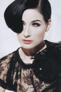
Natalie: I like this. You look beautiful. It's high fashion, clean and shows you off well. I love your dress, and the fishnet veil. Good job!
Adele: I like the whole concept. But I don't think the angle of your face look great here. Your head look so big in this photo. But the styling is quite fabulous. The pose is strong. Good job
Amanda: I am not sure about the fishnet, but it is unique. I really enjoy everything else here. It's a simple, yet really effective high fashion cover that is striking, fierce, and beautiful. I really really do like this. Not much else to say, other than great work!
Hayley: I was worried about you going into this week cause I've never thought of Dita Von Teese as a cover model, but I really like this picture. I like the fishnet. We can still see you perfectly fine and without it, this picture might have verged on boring. It adds to the photo and i don't see how it would detract. I like the intense look you're giving us and it works well with the overall theme of the cover.

Natalie: I think that you do look really beautiful here, but I wish you were a little more happy! You just look so sad. At least you're communicating emotion to the camera- something that will help you a lot in this competition. Good job overall.
Adele: You look beautiful but the cover itself pretty boring. Your face here is strong. I love the connection that you made with the camera. The angle of your face is great.
Amanda: Natalie, not every cover has to be all "happy," you know. You can have a sweet, commercial shot that sucks you in the way this one does. There's an innocence here that is just adorable, and a smile might actually ruin it. I love your hair, Eliza. I love your eyes. The styling is great and this is just too cute. I would totally notice this one because it's NOT the boring, cliche cover that Natalie seems to want. Good work!
Hayley: There's something about the picture that makes your skin look a bit oily. That said, I like the styling and the vibe of the photo. Not the most exciting, but it's a classy cover and skin aside, you look good in it.

Natalie: You look a lot like you do in your avatar, which isn't a problem, just something I saw. To me, this is just very average. It's not very memorable, but there's not too much wrong with it either. I wish you were showing more emotion, but I like your outfit.
Adele: I'm not really a fan of this photo compared to your first two photos. You have a great look but I don't think that you use your look as your advantage this week. I think you can do better than this
Amanda: You look like a zombie. I keep saying that I know your baggy eyes are going to catch up with you, and this might be when they do. Your expression is just so... vacant. It's like you're hypnotized. Your hair is great, but everything else is just bland. Nothing sticks out to me, and I'm drawn in by your expression, then repulsed. Those eyes are just so droopy! I'm not going to recommend plastic surgery or anything, but... perk up a little, okay?
Hayley: Do you have any proficiency with Photoshop or another program like that? If you do, it might be a good idea to remember to touch up the eyes in your photos since the "bags" seem to be a recurring problem for you. It definitely makes you look tired and worn out in this cover. I do like your top, though. A nice, dramatic plunge while still remaining tasteful.

Natalie: You look really pretty here, and I like that you're highlighting your accomplishments. I even like your pose, because that's not one you see often for a magazine cover. Very commercial. Good job!
Adele: Good cover, but there's nothing interesting about this photo. Your styling was just okay for me. But I love your position in the cover. Very different. Overall it was just okay for me
Amanda: This is good. A tad generic, but good. The pose is something different and I like your dress. You look happy and relaxed and are advocating the weight loss you managed to pull off. I do like it, but there isn't anything completely memorable aside from a pose unique for magazines. Nothing about this is something I haven't seen before. Hopefully that's enough to keep you going!
Hayley: This photo is very commercial, but it's also very safe. There's not really anything about this photo I can really criticize, but there's also not really anything about this I can praise. This won't be a memorable one, but I doubt you're in much danger with this because we're still at the point in the competition that "safe" will still get you by cause you can generally count on someone else bombing

Natalie: This is really, really cute. You look great here, and I love the hat. I wish the "back to school cool" thing weren't on there, but that's not really under your control. Overall, I think you found a really strong, commercial photo this round.
Adele: Very cute and very commercial!!! The cover and the concept look great. I love the energy that you gave us in the photo. Overall, I think you did a great job, Kate
Amanda: Love this. Your smile is radiant, I love the hat, and it's an innocent, cute, memorable photo that isn't something that conforms to typicality. I do notice the bottom is cut off, but to remove that annoying text box, it was very necessary. Overall, this is great and way better than last round's nightmare. Keep up the good work, Kate!
Hayley: The styling definitely fits with the magazine you're going with. I love the smile and the styling. I do think that the magazine itself shouldn't have covered you up with so much text, but that's why they work for Teen Vogue instead of the grown-up Vogue. You look beautiful in this shot and it's very commercial, so it's a great week for you.

Natalie: Once again, a good job from you. I think that you sell yourself well here, including that short hair. Your neck looks great, and you overall have a great sense of style. Good job!
Adele: Wow. I love your look. And the styling is amazing. Very elegant and graceful. Second week in a row, you really impressed me. The other girl better watch out!!!
Amanda: No gripes here. You look amazing as always. Very mature, very gorgeous, very striking. I love the lighting. I love your smile. I don't know if there's anything I don't like. Great job!
Hayley: I love the styling in this photo; very commercial. The pose is fantastic, too. My only problem is with your hair. I actually don't like that haircut on you. But even then, I don't hate it. I just think there are more flattering hairstyles for you. It's a very small thing for me to pick on, though, cause this is overall a fantastic cover.

Natalie: I like most of this. You look like you're having fun with this type of photoshoot, and I love the overall quirkiness. I love love love your outfit, and the hat is awesome. I wish the background weren't so plain, but overall I think you did a good job.
Amanda: Very, very unique. I like your hair. Plus the hat. You know me and hats. The one issue I have, though, is that it obscures your eye - if your eye were peeking out from underneath it, it would be one step up. It is kind of boring given your white shirt on a white background, but it's unique, original, and definitely your best yet. Good job!
Adele: Much better than last week. Love the quirkiness in this photo. The styling and concept is unique and interesting but Nat was right. The setting. You need to work on that matter. For the second week in a row, you gave us a very boring setting. Work on that!!!
Hayley: Definitely quirky and definitely a risk. Unfortunately, I'm not that big of a fan of this cover. I understand that the outfit is meant to be a nod to French style, especially since the title of the magazine itself is French, but I really don't like that outfit on you. I'm also not a fan of the positioning of the hat itself. I do like your face as your expression works well with the vibe you were going for in this picture. Also, I really do appreciate that you're taking a risk this week. Especially since I feel like the majority of the models this week played it very safe. So, that's something I have to take into consideration when I do my rankings, cause I want to encourage people to take risks, even if it may fall a little short of where I'd like it to be.

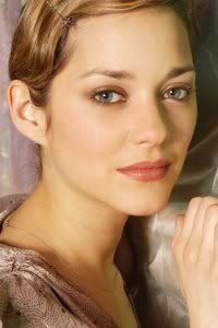
Natalie: This is pretty good, Marion. I like your pose and your expression, but I guess I feel like something is missing. I think that your expression is too high fashion, while your look is too commercial, so you overall just walk into a strange limbo, and that's what's detracting from this.
Adele: Very simple and elegant. The angle is great. I like the pose. Very calm and serene. I love your eye contact too. Overall, good job, Marion
Amanda: Very unique with the pose and the way your hair falls. I find it sexy. Very French and true to your roots. I find it odd that an airline magazine would have such a high-fashion cover, but this might be one I'd want to take with me after my flight. Your expression gets me noticing. Your styling is great. I'm going to remember this one!
Hayley: You do look tired in this photo. Not the most exhausted model this round, but it's there. I love your hair and that's an interesting pose for a magazine cover. It's a nice, subtle way to differentiate yourself from the competition. Overall, not my favorite photo from you, but still a solid showing.

Natalie: Love this. I think that in your past two shots, you've had a lot of potential, and it's really seen here. The hat, look and outfit are all very cohesive, and this is just a great cover. Plus, props for helping out Danielle. Good job!
Adele: The styling is unique and different. Love your beautiful hazel eyes here. Amanda's going to love the hat. I still want more from you, cause you have that potential. I don't think you live up your potential yet, Mo!!!
Amanda: I don't know about this. Yes, I love the hat, and your styling in general, but the photo is darkened and your face is somewhat weak because of it. Nothing sucks me in to notice you! It's very styling, but like Adele, I want something more. There's something missing here, and I think it's in your expression. I will give you points, however, for helping Danielle. Very gracious thing to do
Hayley: One thing that you have in your favor, that'll definitely help you in this competition is that you have dark, striking features. They're prominently on display in this photo. I love the styling and I love the vibe from the photo. However, I feel like either there is a very slight problem with the quality of the photo or a very slight problem with your skin in the photo. I can't quite put my finger on it, but there was just something there that gave me a negative reaction when I first saw the photo. Looking at it again and the edges of the text, I think the quality of the photo is what's slightly off. It's not that bad, though, and it's something that I might not normally have noticed, but just jumped out for me this time.

Natalie: This is just okay for me, Penelope. Your look is a little... scary, almost. I'm not too sure how I feel about the slightly wet looking hair either. Sorry, this just isn't doing much for me.
Adele: I was surprised when I saw this at first. Natalie was right. Your look here was quite scary. I think it's because of your face expression. You did so good for the first two weeks. I don't think, this is a strong photo from you.
Amanda: I don't see scary, but this is very zoomed-in and I think that's my issue with it. If you were a bit less front and center, we could get a better feel of the setting, since there is one but we don't get a feel for it. I do like your eyes, but again, I almost notice them too much. It's not terrible, but it isn't the strongest, either.
Hayley: This is such a beautiful shot of you. There's nothing really memorable about this cover, but it still works really well for you, at the same time. It's weird. It's just a solid picture that I would imagine will just get you safely through the round.
Welcome to your Third Judging Session. This week you need to submit a photo for Magazine Cover or Spread for your celebrity.
Let's start our judging session for this week

Natalie: This is just okay for me. It's nice, but not much about it really sticks out, nor do I dislike that much about it. I like you dress, but I wish you were a bit more smiley. That's about all! Good job.
Adele: Nice photo, I like the styling. The color of the magazine is a little bit off for me. It make the magazine unappealing for me. The pose a little bit stuff. You need to work hard on that.
Amanda: I find your facial expression to be somewhat weak, and because of it you look older than you actually are. I can't decide if this is a good or bad thing because you're freaking beautiful, yet you're not completely memorable. This just sticks into a sea of other commercial covers. Nothing about it catches my eye... except for the fact that this is a cover from the Baltic (Latvia, specifically). That's the most unique thing about this and that isn't the unique thing you want to have. The pose is good, but typical. Like Natalie, I like it, but I'm not going to remember it. That's plenty to get you to next round, so worry not

Hayley: I'm going to have to echo the "not memorable" sentiment. There's a little something off-putting about your facial expression, but it doesn't sink the photo. It works. In the end, if I had to describe this cover in one word, it'd be "Safe".

Natalie: Oh boy... I am not sure about this. The yellow is really, really overbearing. You look nice, and it's definitely a high fashion risk, but we'll have to see how it compares to the others. Part of me likes the yellow, and part of me doesn't.
Adele: Brit, that was too yellow.. I think you face look strong and you look confident in the photo but the whole concept is a little bit too much for me.
Amanda: I see this cover and I can say this: I'm definitely going to remember it. Is that a good thing? Not exactly. I'm going to remember it for being canary rather than remembering YOU. It's a great artistic cover, but it needs to be toned down. Dakota's V cover was toned down somewhat from its original, and this needs a similar touch-up. I like the high-fashion risk and it's very striking, but it's not because of you. You're covered in yellow mud and become an afterthought. I'm starting to sound like a broken record... xD. I do like this, it's just a bit too in-your-face. Like I said: Just tone it down a little! Play with the brightness and you've got yourself something amazing.
Hayley: The level of yellow in this photo oddly doesn't bother me. I actually like it. I love this cover because of how artistic it feels. It's strange because normally, I'd hate that the level of light washes you out a bit and I'd hate the fact that your bangs are hiding your eyes, but it all comes together in this photo to actually be really good.

Natalie: I'm sorry Danielle, I'm just not a huge fan of this. The cover looks alright, even if it's a bit low-res. I think that for you though, the bangs are heavy, and the darkness around your eyes isn't doing you much good. I'm sorry :/
Adele: You look like a doll!!! I'm a fan of this photo actually. The styling is bold and provocative. It's great to see this side of you actually. I think you improved from last two weeks.
Amanda: So you outsourced this to your rival? That's... a very unusual tactic, but I don't know if there's anything illegal about that. That alone is a rather amusing fact. I do want to like this, but like Natalie, I'm not sold on the bangs or the expression, especially the eyes. However, the styling is GREAT and I love how your hair cascades down your shoulder. It's fierce, it's a risk, and despite my quibbles, it all turns out good. I'll be ranking you higher than Natalie will

Hayley: Get ready for an echo because everything I feel about this photo has been said by the other judges. I think it's hilarious that one of the other competitors made this photo into a cover for you, but there's no rule against it. The bangs do feel very heavy in this picture, though. That might actually be my only problem with this photo, though. I can't find anything else to nit-pick at.

Natalie: I like this. You look beautiful. It's high fashion, clean and shows you off well. I love your dress, and the fishnet veil. Good job!
Adele: I like the whole concept. But I don't think the angle of your face look great here. Your head look so big in this photo. But the styling is quite fabulous. The pose is strong. Good job
Amanda: I am not sure about the fishnet, but it is unique. I really enjoy everything else here. It's a simple, yet really effective high fashion cover that is striking, fierce, and beautiful. I really really do like this. Not much else to say, other than great work!
Hayley: I was worried about you going into this week cause I've never thought of Dita Von Teese as a cover model, but I really like this picture. I like the fishnet. We can still see you perfectly fine and without it, this picture might have verged on boring. It adds to the photo and i don't see how it would detract. I like the intense look you're giving us and it works well with the overall theme of the cover.

Natalie: I think that you do look really beautiful here, but I wish you were a little more happy! You just look so sad. At least you're communicating emotion to the camera- something that will help you a lot in this competition. Good job overall.
Adele: You look beautiful but the cover itself pretty boring. Your face here is strong. I love the connection that you made with the camera. The angle of your face is great.
Amanda: Natalie, not every cover has to be all "happy," you know. You can have a sweet, commercial shot that sucks you in the way this one does. There's an innocence here that is just adorable, and a smile might actually ruin it. I love your hair, Eliza. I love your eyes. The styling is great and this is just too cute. I would totally notice this one because it's NOT the boring, cliche cover that Natalie seems to want. Good work!
Hayley: There's something about the picture that makes your skin look a bit oily. That said, I like the styling and the vibe of the photo. Not the most exciting, but it's a classy cover and skin aside, you look good in it.

Natalie: You look a lot like you do in your avatar, which isn't a problem, just something I saw. To me, this is just very average. It's not very memorable, but there's not too much wrong with it either. I wish you were showing more emotion, but I like your outfit.
Adele: I'm not really a fan of this photo compared to your first two photos. You have a great look but I don't think that you use your look as your advantage this week. I think you can do better than this
Amanda: You look like a zombie. I keep saying that I know your baggy eyes are going to catch up with you, and this might be when they do. Your expression is just so... vacant. It's like you're hypnotized. Your hair is great, but everything else is just bland. Nothing sticks out to me, and I'm drawn in by your expression, then repulsed. Those eyes are just so droopy! I'm not going to recommend plastic surgery or anything, but... perk up a little, okay?
Hayley: Do you have any proficiency with Photoshop or another program like that? If you do, it might be a good idea to remember to touch up the eyes in your photos since the "bags" seem to be a recurring problem for you. It definitely makes you look tired and worn out in this cover. I do like your top, though. A nice, dramatic plunge while still remaining tasteful.

Natalie: You look really pretty here, and I like that you're highlighting your accomplishments. I even like your pose, because that's not one you see often for a magazine cover. Very commercial. Good job!
Adele: Good cover, but there's nothing interesting about this photo. Your styling was just okay for me. But I love your position in the cover. Very different. Overall it was just okay for me
Amanda: This is good. A tad generic, but good. The pose is something different and I like your dress. You look happy and relaxed and are advocating the weight loss you managed to pull off. I do like it, but there isn't anything completely memorable aside from a pose unique for magazines. Nothing about this is something I haven't seen before. Hopefully that's enough to keep you going!
Hayley: This photo is very commercial, but it's also very safe. There's not really anything about this photo I can really criticize, but there's also not really anything about this I can praise. This won't be a memorable one, but I doubt you're in much danger with this because we're still at the point in the competition that "safe" will still get you by cause you can generally count on someone else bombing

Natalie: This is really, really cute. You look great here, and I love the hat. I wish the "back to school cool" thing weren't on there, but that's not really under your control. Overall, I think you found a really strong, commercial photo this round.
Adele: Very cute and very commercial!!! The cover and the concept look great. I love the energy that you gave us in the photo. Overall, I think you did a great job, Kate
Amanda: Love this. Your smile is radiant, I love the hat, and it's an innocent, cute, memorable photo that isn't something that conforms to typicality. I do notice the bottom is cut off, but to remove that annoying text box, it was very necessary. Overall, this is great and way better than last round's nightmare. Keep up the good work, Kate!
Hayley: The styling definitely fits with the magazine you're going with. I love the smile and the styling. I do think that the magazine itself shouldn't have covered you up with so much text, but that's why they work for Teen Vogue instead of the grown-up Vogue. You look beautiful in this shot and it's very commercial, so it's a great week for you.

Natalie: Once again, a good job from you. I think that you sell yourself well here, including that short hair. Your neck looks great, and you overall have a great sense of style. Good job!
Adele: Wow. I love your look. And the styling is amazing. Very elegant and graceful. Second week in a row, you really impressed me. The other girl better watch out!!!
Amanda: No gripes here. You look amazing as always. Very mature, very gorgeous, very striking. I love the lighting. I love your smile. I don't know if there's anything I don't like. Great job!
Hayley: I love the styling in this photo; very commercial. The pose is fantastic, too. My only problem is with your hair. I actually don't like that haircut on you. But even then, I don't hate it. I just think there are more flattering hairstyles for you. It's a very small thing for me to pick on, though, cause this is overall a fantastic cover.

Natalie: I like most of this. You look like you're having fun with this type of photoshoot, and I love the overall quirkiness. I love love love your outfit, and the hat is awesome. I wish the background weren't so plain, but overall I think you did a good job.
Amanda: Very, very unique. I like your hair. Plus the hat. You know me and hats. The one issue I have, though, is that it obscures your eye - if your eye were peeking out from underneath it, it would be one step up. It is kind of boring given your white shirt on a white background, but it's unique, original, and definitely your best yet. Good job!
Adele: Much better than last week. Love the quirkiness in this photo. The styling and concept is unique and interesting but Nat was right. The setting. You need to work on that matter. For the second week in a row, you gave us a very boring setting. Work on that!!!
Hayley: Definitely quirky and definitely a risk. Unfortunately, I'm not that big of a fan of this cover. I understand that the outfit is meant to be a nod to French style, especially since the title of the magazine itself is French, but I really don't like that outfit on you. I'm also not a fan of the positioning of the hat itself. I do like your face as your expression works well with the vibe you were going for in this picture. Also, I really do appreciate that you're taking a risk this week. Especially since I feel like the majority of the models this week played it very safe. So, that's something I have to take into consideration when I do my rankings, cause I want to encourage people to take risks, even if it may fall a little short of where I'd like it to be.
Natalie: This is pretty good, Marion. I like your pose and your expression, but I guess I feel like something is missing. I think that your expression is too high fashion, while your look is too commercial, so you overall just walk into a strange limbo, and that's what's detracting from this.
Adele: Very simple and elegant. The angle is great. I like the pose. Very calm and serene. I love your eye contact too. Overall, good job, Marion
Amanda: Very unique with the pose and the way your hair falls. I find it sexy. Very French and true to your roots. I find it odd that an airline magazine would have such a high-fashion cover, but this might be one I'd want to take with me after my flight. Your expression gets me noticing. Your styling is great. I'm going to remember this one!
Hayley: You do look tired in this photo. Not the most exhausted model this round, but it's there. I love your hair and that's an interesting pose for a magazine cover. It's a nice, subtle way to differentiate yourself from the competition. Overall, not my favorite photo from you, but still a solid showing.

Natalie: Love this. I think that in your past two shots, you've had a lot of potential, and it's really seen here. The hat, look and outfit are all very cohesive, and this is just a great cover. Plus, props for helping out Danielle. Good job!
Adele: The styling is unique and different. Love your beautiful hazel eyes here. Amanda's going to love the hat. I still want more from you, cause you have that potential. I don't think you live up your potential yet, Mo!!!
Amanda: I don't know about this. Yes, I love the hat, and your styling in general, but the photo is darkened and your face is somewhat weak because of it. Nothing sucks me in to notice you! It's very styling, but like Adele, I want something more. There's something missing here, and I think it's in your expression. I will give you points, however, for helping Danielle. Very gracious thing to do

Hayley: One thing that you have in your favor, that'll definitely help you in this competition is that you have dark, striking features. They're prominently on display in this photo. I love the styling and I love the vibe from the photo. However, I feel like either there is a very slight problem with the quality of the photo or a very slight problem with your skin in the photo. I can't quite put my finger on it, but there was just something there that gave me a negative reaction when I first saw the photo. Looking at it again and the edges of the text, I think the quality of the photo is what's slightly off. It's not that bad, though, and it's something that I might not normally have noticed, but just jumped out for me this time.

Natalie: This is just okay for me, Penelope. Your look is a little... scary, almost. I'm not too sure how I feel about the slightly wet looking hair either. Sorry, this just isn't doing much for me.
Adele: I was surprised when I saw this at first. Natalie was right. Your look here was quite scary. I think it's because of your face expression. You did so good for the first two weeks. I don't think, this is a strong photo from you.
Amanda: I don't see scary, but this is very zoomed-in and I think that's my issue with it. If you were a bit less front and center, we could get a better feel of the setting, since there is one but we don't get a feel for it. I do like your eyes, but again, I almost notice them too much. It's not terrible, but it isn't the strongest, either.
Hayley: This is such a beautiful shot of you. There's nothing really memorable about this cover, but it still works really well for you, at the same time. It's weird. It's just a solid picture that I would imagine will just get you safely through the round.

