Post by Hayley Williams on May 14, 2012 19:28:10 GMT -5
Hello Girls! 
Judging by the time that I normally see her on to post, I am guessing that the lovely Miss Adele is asleep at this moment. In the past, when the ranking has been completed during a time that is not convenient for her to be on and post, she has asked one of the judges to post for her. I am assuming that this would be the case again this round and since I am here and able, I will be posting the results today.
This week, you needed to submit a photo embodying Hautre Couture. I have to say that regardless of where you all placed this week, it was a strong week from everyone. We just have to nitpick at this point.
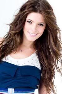
Ashley

Natalie: This is just okay for me, Ashley. I'm not convinced on how Haute Couture that dress is, though I'm certainly no expert. You look pretty, and I like the misplaced scarf, but I'm still not sold on that dress. Execution from you is only okay for me this week.
Adele: I like the dress, I think the color looks good on you. I love the detail of those ruffles in your outfit. Your body language is good. Very graceful but your face this week is quite weird. I don't think the expression looks beautiful on you. That was my main concern this week for you
Amanda: I concur with the others. I'm not so sure how "couture" it is, because it doesn't strike me as custom, and your expression makes you look... different. I'm not even sure if this is you! I like the scarf and the effect it has, but it's not enough to save this photo from the abyss of averageness. Perhaps a setting would help, perhaps a slightly more "custom" dress could. It's a nice dress, but the photo itself is just plain. At this stage of the competition, we want more than that. I hope it's enough for you to stay.
Hayley: The dress itself may be very busy, but for the theme given this week, this picture is a little too boring. Haute Couture is not the week to play it safe. Safe is one of the worst things you can actually do this week. So, I like the dress, the pose is ok, but could be better, and the setting is plain.
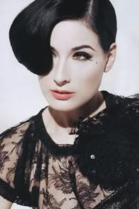
Dita

Natalie: Each time I've looked at this, I've been blown away, and this is no exception. I think this dress is amazing, and you look gorgeous here. It's very over the top, and I like it in every way. I really like your pose, and the setting too. Great job this week!
Adele: Gorgeous. Over-the-top.. I love that color on you. You look very confident. However, I'm not really a fan of some parts of the dress, especially the middle one. The flowers just didn't work for me, but I really like the top and bottom parts of this dress.
Amanda: Holy hell that dress is amazing. The setting is beautiful, and you own it. The color is amazing, the dress is unique, the pose is sexy, your hair is great, your expression is, uh, okay, but I love the accessories and everything else, though, like Adele, the flowers are a bit iffy for me. I'm not completely sold on that, but everything else... I'm so glad we used that save on you
Hayley: What a phenomenal dress you're wearing. I love how it's flowing and I love the way you're styled. The setting is nice and makes it look a bit more classy. Another great photo again this week.
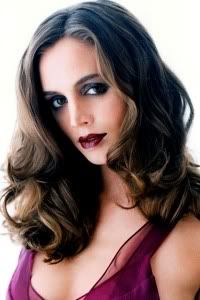
Eliza

Natalie: Oh Eliza, I want to like this. Well, no. I do like this. I like this a lot. The problem is- we've seen this before. The setting, look and pose- we've seen it all before. At the very least, it's not the same dress. I really like your hair in this. I'm trying to find things that I like, but there's no originality here, and that's going to hurt a bit. I do know that you have a limited portfolio, so I know you're doing your best. You have rewards to help you out though- don't give up!
Adele: I'm okay with the fact that you want to use the photo from the same photoshoot. But, I felt it was like yesterday, I've watched this side of you. Apart of that, I think you look stunning. The outfit is great and dramatic. And your face expression is so strong in this photo. I love that
Amanda: The same photoshoot thing isn't as big a hindrance as it could be, as your dress is different. Had this been the same dress, I'd have been forced to eliminate you. Sure, the styling is pretty similar, and that doesn't change that this is awesome, but we just saw something like this. It's great, but it loses its flair because of how you owned with this same sort of thing last round. The dress is nowhere near as amazing, but it's still good. The hair works, the expression works, but like the others, there's no wow factor anymore. I really like it, but it's nothing new. That should be enough to get you through to next round... but I'm concerned for your safety in the near future, and if your portfolio is this limited, then... can you make All-Stars with it?
Hayley: Yeah, reusing from the same shoot so soon is definitely a strike against you this week. I do love your styling in the picture and the dress is nice. It's not the most exciting, but it works. I still like the vibe of the photo and your posing, too.
Kate
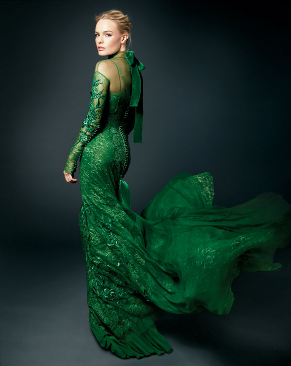
Natalie: This is just all right for me, Kate. The dress is gorgeous and fits the theme well, and I'm actually okay with the plain background because I like the lighting, and this shoot in particular is more about your dress/expression. Unfortunately, it's your expression that's lacking. You look rather bored... or maybe upset. There are parts of this photo that I like, but your expression just makes it a decent photo overall. We've seen better from you!
Adele: I actually like your expression. I really want to see the serious side of you, and you gave it in this photo. My problem, however with the way you presented your dress. I don't think you shown us the strongest angle of your dress. I really want to see the details on the front side of the dress.
Amanda: I WANT YOUR DRESS. I LOVE that color. It's really... Haute. I happen to like your expression because it's serious, it's fierce, it's sexy, and that dress looks amazing on you. I don't mind that this is a studio shoot, because the lighting makes this even more badass, and I happen to love the angle. I don't know what the other two are seeing - I love this. It's a very fanciful dress that could be couture, but it might not be - that may be the only issue here. But still, I think this is one of your best
Hayley: I love this photo from the neck down. I don't know what it is about your head in this photo, but it feels huge. Disproportionately big when compared to the rest of your body. That really is not a flattering angle for your face. However, I love the dress and I love the posing of your body.
Kirsten

Natalie: I think all of this fits together decently, except for the bottom half of the dress. It looks like a hot-air balloon, to be honest. It's MASSIVE, and it comes across as distracting. I do like the top part of the dress and the setting. I don't really agree with your expression being correct- I think you look bored. I think while this shoot doesn't necessarily call for a lot of energy, I would've liked more emotion!
Adele: Wow, that was so crazy!!! I like it. Very risky, over-the-top and you look stunning in this photo. Same with Natalie, I think the top part was better than the bottom. The bottom part was kinda weird but this is what this week should be all about. Being crazy and experimental with the dress. The setting is wonderful too
Amanda: Like Natalie, the first thought I had was "balloon," and that was neutral for me. It's a very dated concept, but like you said, this is Marie Antoinette, so "dated" is justifiable. I'm just curious if there was something more contemporary that you could show us. Something where we actually get to see your BODY. Your face and hair are great, but the quality or lighting seems to be off. I'm saying lighting. This is good, but it just isn't great - it's couture, but it's dated, and that just puts me on the fence. It's good enough, at least
Hayley: I'm fine with your circus tent dress because of the theme this week. The pose and the styling work nicely for you. I also like the setting for the picture. While I'm not thrilled about that dress, it's fine, too. Not your strongest this week, but still a good showing.
Kristen

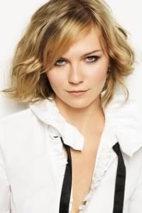
Natalie: You seem to have the opposite problem from some of the other girls this week. While I'm not totally buying your dress, your expression is amazing. This is exactly what I want to see when I'm looking for this kind of shoot. Your hair looks great as well. I am not even sure what you're wearing as your article of clothing to be honest, and I don't really like the large collar. You really did nail the expression though!
Adele: Agree with Nat, So fierce, girl!!! I think this is your best photo in term of your expression. Very confident and the pose is great too. But your couture, was quite simple and too safe. So I'm a little bit torn this week for you, because you never looked this great and confidence in your photo.
Amanda: This isn't couture for me. Your expression is fierce and I love it, but I'm not sold on your hair, the pose, or the styling. You look almost like a monster. You look like a vampire straight out of Scooby-Doo. And I think that's why I dislike this. That outfit just isn't doing anything for me. The collar may be the guilty party here... I want to see NECK, not that thing. Sorry Kristen, this isn't good for me :/
Hayley: The fashion value in this shot is high, so you hit that aspect of the theme well. Not sure how well the rest of the photo fits the theme. As a modeling shot, I actually really like this. The outfit is fine, but there are definitely better from other models this round. If you stay this week, it'll be based off the modeling side and the part of the theme that you hit.
Marion

Natalie: I like this. I really really really like your pose. I love the starving model look for some reason, and I think it really compliments haute couture. The dress is a little poofy for me, but it's not overbearing. I am a fan of the hat here, and I like the antiquated setting. Good job this week, Marion!
Adele: Not a fan of your expression. You look very uncomfortable but your couture is definitely my favorite couture this week. I love those crazy ruffles on your dress. And you accessorized it with the hat to add the dramatic value in this photo. Decent job from you this week..
Amanda: I like the hat, but you probably expected that. I don't like the veil over your face, since that severely restricts your expression and destroys your already weak face. I don't like the overdone eyeshadow, and if you have a hat like that, you don't need that kind of makeup. I like the dress, but the setting is just okay. The background sort of makes the dress camouflage for you. It just doesn't stand out like it could! It's good, don't get me wrong, but I don't see "great" here. I like it, but I don't love it, and that seems to be a recurring theme this cycle...
Hayley: I love that dress, the pose is nice, and the styling is great. I like how the color scheme all ties into one another and fits well with the mood of the overall picture itself. Your facial expression is a little lackluster for me and I'd say that's probably the weakest part of the photo. I like the way everything else was done.
Monica

Natalie: I actually think this does look like you! And this has grown on me since I've first seen it. It doesn't go overboard, but I think that haute couture is the one shot to really go over the top and have it sell. This doesn't mean you've done poorly, I'd just like to see a bit more of a risk. I really like your expression here, but I'm not sure how I feel about the setting. It's a little bright for this photoshoot, but maybe that's just my perception of it. And we all know that perception is not always reality ... Anyway, I think you did a fine job this week, I'm just not blown away.
Adele: I love this. Very dramatic and intense. You look gorgeous and sexy in this photo, girl. Not a great of fan, same with Kristen's couture, I think the color is too boring. But at least you manage to inject more excitement with those part (Is that ruffles?) on your hand. However I really love your confidence and the overall concept for your photoshoot this week.
Amanda: This is unquestionably more "you" than last round. I like it, but I don't love it. It's too black, and not "couture" enough - parts here look like they could be worn by anyone. I like the ruffles and the pose, since those at least add SOME couture value, and the lipstick is delicious and injects a little sparkle of color. I like the setting, but like the others... nothing here blows me away. Still like it though
Hayley: I definitely really like this photo. That's such an interesting outfit. The posing and facial expressions definitely works with the dress, even if I normally wouldn't have really cared for that facial expression. I like your setting, too. Nothing really stands out as being wrong in this photo, for me.

Judging by the time that I normally see her on to post, I am guessing that the lovely Miss Adele is asleep at this moment. In the past, when the ranking has been completed during a time that is not convenient for her to be on and post, she has asked one of the judges to post for her. I am assuming that this would be the case again this round and since I am here and able, I will be posting the results today.
This week, you needed to submit a photo embodying Hautre Couture. I have to say that regardless of where you all placed this week, it was a strong week from everyone. We just have to nitpick at this point.
Ashley

Natalie: This is just okay for me, Ashley. I'm not convinced on how Haute Couture that dress is, though I'm certainly no expert. You look pretty, and I like the misplaced scarf, but I'm still not sold on that dress. Execution from you is only okay for me this week.
Adele: I like the dress, I think the color looks good on you. I love the detail of those ruffles in your outfit. Your body language is good. Very graceful but your face this week is quite weird. I don't think the expression looks beautiful on you. That was my main concern this week for you
Amanda: I concur with the others. I'm not so sure how "couture" it is, because it doesn't strike me as custom, and your expression makes you look... different. I'm not even sure if this is you! I like the scarf and the effect it has, but it's not enough to save this photo from the abyss of averageness. Perhaps a setting would help, perhaps a slightly more "custom" dress could. It's a nice dress, but the photo itself is just plain. At this stage of the competition, we want more than that. I hope it's enough for you to stay.
Hayley: The dress itself may be very busy, but for the theme given this week, this picture is a little too boring. Haute Couture is not the week to play it safe. Safe is one of the worst things you can actually do this week. So, I like the dress, the pose is ok, but could be better, and the setting is plain.
Dita

Natalie: Each time I've looked at this, I've been blown away, and this is no exception. I think this dress is amazing, and you look gorgeous here. It's very over the top, and I like it in every way. I really like your pose, and the setting too. Great job this week!
Adele: Gorgeous. Over-the-top.. I love that color on you. You look very confident. However, I'm not really a fan of some parts of the dress, especially the middle one. The flowers just didn't work for me, but I really like the top and bottom parts of this dress.
Amanda: Holy hell that dress is amazing. The setting is beautiful, and you own it. The color is amazing, the dress is unique, the pose is sexy, your hair is great, your expression is, uh, okay, but I love the accessories and everything else, though, like Adele, the flowers are a bit iffy for me. I'm not completely sold on that, but everything else... I'm so glad we used that save on you
Hayley: What a phenomenal dress you're wearing. I love how it's flowing and I love the way you're styled. The setting is nice and makes it look a bit more classy. Another great photo again this week.
Eliza

Natalie: Oh Eliza, I want to like this. Well, no. I do like this. I like this a lot. The problem is- we've seen this before. The setting, look and pose- we've seen it all before. At the very least, it's not the same dress. I really like your hair in this. I'm trying to find things that I like, but there's no originality here, and that's going to hurt a bit. I do know that you have a limited portfolio, so I know you're doing your best. You have rewards to help you out though- don't give up!
Adele: I'm okay with the fact that you want to use the photo from the same photoshoot. But, I felt it was like yesterday, I've watched this side of you. Apart of that, I think you look stunning. The outfit is great and dramatic. And your face expression is so strong in this photo. I love that
Amanda: The same photoshoot thing isn't as big a hindrance as it could be, as your dress is different. Had this been the same dress, I'd have been forced to eliminate you. Sure, the styling is pretty similar, and that doesn't change that this is awesome, but we just saw something like this. It's great, but it loses its flair because of how you owned with this same sort of thing last round. The dress is nowhere near as amazing, but it's still good. The hair works, the expression works, but like the others, there's no wow factor anymore. I really like it, but it's nothing new. That should be enough to get you through to next round... but I'm concerned for your safety in the near future, and if your portfolio is this limited, then... can you make All-Stars with it?
Hayley: Yeah, reusing from the same shoot so soon is definitely a strike against you this week. I do love your styling in the picture and the dress is nice. It's not the most exciting, but it works. I still like the vibe of the photo and your posing, too.
Kate

Natalie: This is just all right for me, Kate. The dress is gorgeous and fits the theme well, and I'm actually okay with the plain background because I like the lighting, and this shoot in particular is more about your dress/expression. Unfortunately, it's your expression that's lacking. You look rather bored... or maybe upset. There are parts of this photo that I like, but your expression just makes it a decent photo overall. We've seen better from you!
Adele: I actually like your expression. I really want to see the serious side of you, and you gave it in this photo. My problem, however with the way you presented your dress. I don't think you shown us the strongest angle of your dress. I really want to see the details on the front side of the dress.
Amanda: I WANT YOUR DRESS. I LOVE that color. It's really... Haute. I happen to like your expression because it's serious, it's fierce, it's sexy, and that dress looks amazing on you. I don't mind that this is a studio shoot, because the lighting makes this even more badass, and I happen to love the angle. I don't know what the other two are seeing - I love this. It's a very fanciful dress that could be couture, but it might not be - that may be the only issue here. But still, I think this is one of your best
Hayley: I love this photo from the neck down. I don't know what it is about your head in this photo, but it feels huge. Disproportionately big when compared to the rest of your body. That really is not a flattering angle for your face. However, I love the dress and I love the posing of your body.
Kirsten

Natalie: I think all of this fits together decently, except for the bottom half of the dress. It looks like a hot-air balloon, to be honest. It's MASSIVE, and it comes across as distracting. I do like the top part of the dress and the setting. I don't really agree with your expression being correct- I think you look bored. I think while this shoot doesn't necessarily call for a lot of energy, I would've liked more emotion!
Adele: Wow, that was so crazy!!! I like it. Very risky, over-the-top and you look stunning in this photo. Same with Natalie, I think the top part was better than the bottom. The bottom part was kinda weird but this is what this week should be all about. Being crazy and experimental with the dress. The setting is wonderful too
Amanda: Like Natalie, the first thought I had was "balloon," and that was neutral for me. It's a very dated concept, but like you said, this is Marie Antoinette, so "dated" is justifiable. I'm just curious if there was something more contemporary that you could show us. Something where we actually get to see your BODY. Your face and hair are great, but the quality or lighting seems to be off. I'm saying lighting. This is good, but it just isn't great - it's couture, but it's dated, and that just puts me on the fence. It's good enough, at least
Hayley: I'm fine with your circus tent dress because of the theme this week. The pose and the styling work nicely for you. I also like the setting for the picture. While I'm not thrilled about that dress, it's fine, too. Not your strongest this week, but still a good showing.
Kristen

Natalie: You seem to have the opposite problem from some of the other girls this week. While I'm not totally buying your dress, your expression is amazing. This is exactly what I want to see when I'm looking for this kind of shoot. Your hair looks great as well. I am not even sure what you're wearing as your article of clothing to be honest, and I don't really like the large collar. You really did nail the expression though!
Adele: Agree with Nat, So fierce, girl!!! I think this is your best photo in term of your expression. Very confident and the pose is great too. But your couture, was quite simple and too safe. So I'm a little bit torn this week for you, because you never looked this great and confidence in your photo.
Amanda: This isn't couture for me. Your expression is fierce and I love it, but I'm not sold on your hair, the pose, or the styling. You look almost like a monster. You look like a vampire straight out of Scooby-Doo. And I think that's why I dislike this. That outfit just isn't doing anything for me. The collar may be the guilty party here... I want to see NECK, not that thing. Sorry Kristen, this isn't good for me :/
Hayley: The fashion value in this shot is high, so you hit that aspect of the theme well. Not sure how well the rest of the photo fits the theme. As a modeling shot, I actually really like this. The outfit is fine, but there are definitely better from other models this round. If you stay this week, it'll be based off the modeling side and the part of the theme that you hit.
Marion

Natalie: I like this. I really really really like your pose. I love the starving model look for some reason, and I think it really compliments haute couture. The dress is a little poofy for me, but it's not overbearing. I am a fan of the hat here, and I like the antiquated setting. Good job this week, Marion!
Adele: Not a fan of your expression. You look very uncomfortable but your couture is definitely my favorite couture this week. I love those crazy ruffles on your dress. And you accessorized it with the hat to add the dramatic value in this photo. Decent job from you this week..
Amanda: I like the hat, but you probably expected that. I don't like the veil over your face, since that severely restricts your expression and destroys your already weak face. I don't like the overdone eyeshadow, and if you have a hat like that, you don't need that kind of makeup. I like the dress, but the setting is just okay. The background sort of makes the dress camouflage for you. It just doesn't stand out like it could! It's good, don't get me wrong, but I don't see "great" here. I like it, but I don't love it, and that seems to be a recurring theme this cycle...
Hayley: I love that dress, the pose is nice, and the styling is great. I like how the color scheme all ties into one another and fits well with the mood of the overall picture itself. Your facial expression is a little lackluster for me and I'd say that's probably the weakest part of the photo. I like the way everything else was done.
Monica

Natalie: I actually think this does look like you! And this has grown on me since I've first seen it. It doesn't go overboard, but I think that haute couture is the one shot to really go over the top and have it sell. This doesn't mean you've done poorly, I'd just like to see a bit more of a risk. I really like your expression here, but I'm not sure how I feel about the setting. It's a little bright for this photoshoot, but maybe that's just my perception of it. And we all know that perception is not always reality ... Anyway, I think you did a fine job this week, I'm just not blown away.
Adele: I love this. Very dramatic and intense. You look gorgeous and sexy in this photo, girl. Not a great of fan, same with Kristen's couture, I think the color is too boring. But at least you manage to inject more excitement with those part (Is that ruffles?) on your hand. However I really love your confidence and the overall concept for your photoshoot this week.
Amanda: This is unquestionably more "you" than last round. I like it, but I don't love it. It's too black, and not "couture" enough - parts here look like they could be worn by anyone. I like the ruffles and the pose, since those at least add SOME couture value, and the lipstick is delicious and injects a little sparkle of color. I like the setting, but like the others... nothing here blows me away. Still like it though
Hayley: I definitely really like this photo. That's such an interesting outfit. The posing and facial expressions definitely works with the dress, even if I normally wouldn't have really cared for that facial expression. I like your setting, too. Nothing really stands out as being wrong in this photo, for me.

