Post by Amanda Kimmel on Apr 28, 2012 18:17:53 GMT -5
Hey girls! Amanda here with your judging for the fourth session! This week, you were each to embody a different sign of the Zodiac.
We're going to start with Aries and go through Pisces, so ya know.
Adele: Very aggressive, confident, over the top, fiery.. You nailed it for me. I love the fashion value in the photo. Personally my favorite photo from you J-Hud. I think you photo was a right match for an Aries. Great job!!!
Natalie: I think there's a great fashion value in this photo for you, and it works well. I do wish, however, that you were wearing a little less makeup! You're pretty, show it!
Amanda: Yuck. Take. Off. That. Mask. Your face looks like a rubbery monster mask. It's UGLY. The styling is good, but I can't get over how terrible your face is. I'm an Aries myself (though I'm no extrovert), and well... I'm kind of appalled by this. I don't see confidence. I just see... rubber. I do like your hair. And the shadows. But... ugh.... sorry Jennifer, I don't like this :/
Amanda: Okay, I've given it a little more consideration. As much as I dislike your face, I see "ram" in it. Forgive me for not seeing that before. I like this a bit more after putting that together... forgive me, I've been really slow lately, not to mention that, being an Aries, I tend to rush into things and jump to conclusions a bit too quickly -_-
Hayley: It's not a literal interpretation, so you've definitely left yourself open to differing interpretations of both your sign and your photo. However, I like this photo and think it fits. Your photo matches your description, which makes sense with Aries. I do wish your eyes were slightly more open, there was a little less of a shadow covering your neck, and you had a bit less makeup, but the pose is confident, the dress is great, the hair is great, and vibe of the photo itself all works really well. Not the best photo we're seeing this round, but still a solid showing and a definite personal improvement for you. Hopefully that improvement will be reflected in the rankings this week. Off-hand, I do think this might be the highest I'll have personally ranked you this Cycle.
 [/center]
Hayley: This is a tough one. Taurus is an Earth sign, so the setting helps in that regard. Your description definitely helps explain why you're dressed the way you are and that lends itself well to the theme aspect of the photo, too, even if there is a bit of a disconnect between you and the setting. The problem with this photo comes from the modeling aspect. Your bangs are creating a shadow over your eyes and we can't see them. There's nothing inherently wrong with the pose, but it's not strong or memorable, either.
Adele: I like this photo. I think the styling is very suitable for the zodiac and I love the Quail idea too. You looked regal in this photo. I like it. The setting and angle are beautiful too.
Natalie: I think that your eyes are more important than the bird, to be honest. While there is a connection to the theme, the overall lack of modelling aspects drags this down. Sorry, it could be better, but I do think
you'll be safe.
Amanda: Meh. I really don't have much else to add. Like Hayley, I hate your bangs because they completely conceal your eyes. They're too long. I totally see the relation to the theme, but you look so lifeless. For a shoot like this, we want you to be full of life! I also must agree about the low modelesquity value - it looks almost candid and your dress is boring. You're in danger this week, but I honestly think someone else is leaving
 [/center]
Adele: You nailed it!!! I didn't expect for anyone to come up with fantastic photo and perfectly nailing the theme. But you did it for me. I love the concept. Right description to accompany with your photo. On the other hand, Do we really have to deal with two "Ditas" now. *Shakes head
Hayley: Great theme integration. One of the best this round. I like how similar, yet different both Ditas are in the picture and everything you described fits with the picture and fits with Gemini. Fantastic job this round.
Natalie: I'm not as crazy about it as the other two. It looks very two-dimensional, and comes across as a tad strange. I mean, everything is technically good, but it just comes off as missing something. Even your explanation is great. I guess it's just a bit of a flat picture, and that's what I don't love about it. Still a good job though.
Amanda: I really love this, but like Natalie, something seems odd about it. It almost looks like a painting. I ADORE the concept and the execution, but it almost doesn't look real to me, either. Everything with the theme and modelesquity works amazingly. This really is a good photo, but... is it a photo, or a painting? When I rank stuff, I'm not going to be able to get over that, but it won't get you last, that's for sure.
Adele: You got the last one. I know it's hard. Your hand really look like a crab but I wish instead of trying to look like a crab (sounds so weird), you would look more and find a photo to match with the characteristic because Cancer is a sign concerned with care, protection, nurturing, highly romantic and even tearful. I guess I want to see a softer side of you more in the photo.
Monica: Well, to be honest, it's not like I didn't try to look hard. I specifically took a trip to the local library so that I could avoid getting an extension, and I did try to find some nurturing photos, but the ones I found either had zero modelling potential or they were covered with words, and thanks to my power outages I couldn't work my usual photoshop magic.
Besides, the shoot description did say:
So I didn't think I would get penalized for going with the symbol... :/
(Especially since Cancer is the hardest freakin' symbol in the whole Zodiac to find pictures for. I've seen it done in other series, and Cancer is the last one picked every time.)
Amanda: It's not your best, obviously, but given the situation, it's probably about the best you could do. This is exactly the reason why I didn't want to do this shoot until the final 9 or 8 or so: I didn't want anyone to get stuck with Cancer. This doesn't have the highest-quality modelesquity ever given what you're wearing (well, that and I don't like it that much), but the pose is great for Cancer the Crab and I do like your hair. It's definitely not FCO material, but given the cards handed to you, I definitely see you going through to next round.
Natalie: I think you did a pretty good job this week, all things considered. It's not an obvious portrayal of your theme, but it's a valid one, so I don't think you lose points there. As a modelling shot, the backdrop and facial expression leave something to be desired. Overall, not bad from you, Monica, despite all the issues!
Hayley: Ok, I've been going so back and forth on this picture that I don't even know what I'm about to type. I'll just start typing and see what comes out and base my ranking on what I've said. I see the pincers you're talking about, so that's a nice allusion to your sign. I like how different the photo is and I like the vibe we get from the color scheme. You have the right amount of make-up to make you look good, too. That's about it for the positives from me. I understand you've had a rough week, but I still have to judge based off of what's in front of me. I wish the sign representation was stronger. It's there, but could have been better. You take up most of the shot itself, so the fact that it's a studio shoot actually doesn't bother me at all. If it wasn't a studio shoot, we still wouldn't have seen much of the background.
Adele: *DEAD!!!. I didn't expect someone to bring a lion. And here you are, giving us a perfect photo to accompany your choice of Zodiac!!!. What can I say, Kirsten!!! I love the emotion. Nice ring and earring. Nailed it!!! Done!!!
Natalie: I think that compared to your past few weeks, this falls a bit flat. It's very zoomed in, and that lion really catches attention. It's not bad, but you've just been so good. Your mouth is also a bit awkward in this photo. Overall, just okay for me.
Amanda: Love this. It's not as good as your past couple, but the literal injection of a lion, mixed with your own pride and passion. Your eyes are incredible, the jewelry definitely shows pride, and this is just majestic. It's not going to get you another first callout, though, but it's definitely going to put you up pretty high. Good work, once again
Hayley: Yet another strong showing from you. It's not my favorite from you, but when you've done as well as you've done so far, a "not my favorite from you" comment doesn't mean you have anything to worry about. I do love that you have an actual lion in the picture and that you're posing with the lion, instead of it being part of the background. The pride you exude works well, too. You look beautiful as always. The more I look at this picture, the more I actually like it. My first impression was to say "I wish you embodied Leo more instead of just having the lion in the picture". However, after repeatedly looking at the photo and dissecting it, I realized that you really are embodying the sign as well as having that literal interpretation next to you. Great job again this week.
Adele: Damn. Why are you so good at this? I really want to give you a bad critique but this photo is pretty damn good. I love your eyes. Even though you're not looking straight at the camera, I still feel connected to this photo. Amazing Kate. Very angelic side of you.
Natalie: This is fantastic. You nailed everything, in my opinion. I have no critique.
Amanda: That splotch of light to your right side is kind of glaring, if you ask me. But aside from that... totally awesome. Your styling is impeccable, your hair is great... you really do look like an angel. I don't know if I like the hand near your face, but honestly, that's only a minor quibble since it's not covering your eyes or lips or anything. Wonderful work, Kate
Hayley: Phenomenal picture. You've captured the purity and the innocence of your sign perfectly. I love the styling, I love the setting, love the vibe... I just love everything about this photo. I'm not sure you could have done better.
Adele: I really like this. I think the photo reflects Libra really well. Thing I like the most from the photo is your body language. To sit on that thing and still looking fashionable really impressed me a lot. I love the fashion value in this photo very much.
Natalie: I think your emanation of the theme is really strong. I don't love the gray backdrop, but I think this photo has strong modelling aspects in a lot of ways. Good job this week!
Amanda: I don't totally love this. I completely see how you relate to the scales of Libra, but the boring setting and the way you're looking away are... iffy for me. I love the styling, since it fits perfectly, and you definitely look like a model, but your face and head in general are almost an afterthought. Perhaps it's your hairstyle here? I don't know. There are a couple of things missing here, but it's not a major deal, so good job
Hayley: Before I even read your description, I thought "I can see Libra in this". The sleeve did make me think of the scales and I'm not completely sure why. Also, I love that you're balancing on that board, since balance is important to your sign. Your sign itself is even sometimes referred to as The Balance. Your styling and posing are great in this photo. I do wish that the boards you were standing on didn't look so rough, though. It causes a slight disconnect between you and it, making it stand out a little more than it should. Otherwise, big fan of your picture this week.
Adele: I really think you did such a great job, Kristen. "People born under this sign are intense, analytical, investigative, probing, digging, wanting to get to the bottom of things". You got this part of description right with your photo. Love the setting, finally. Great job. I'm so happy for you.
Natalie: I quite like this. I think it's a good use of props and black&white photography. I do wish you had a bit more energy, but overall good job!
Amanda: I like it. The black and white adds a risky element that pays off, and your research paid off quite a bit - selling us your photo skills helps. I love the props and setting, your styling is good, and although your face - your lips especially - is a bit weak, it's not enough to drag this down into the abyss of death. Good work
Hayley: I'm not a big fan of your face in this picture. Almost looks like you're working on your orgasm face. I do like the research you put into your sign and your description definitely helps. I also like the impact that's given by this being in black and white. The pose itself is nothing special.
Adele: I think you did great Eliza. I don't expect everyone to come up with the perfect photoshoot photo. Even though this is a screencap, I don't mind if it really worked out well. I love the intensity in the photo. Just be careful with the angle of your face.
Hayley: Very tough round for you it looks like. This is an instance where I'm fine with a screenshot. You probably had no other Sagittarius pictures to choose from, and Eliza still looks like she's posing in this still, so it works on that level, too. The literal sense of the Sagittarius with the archery definitely works well in your favor this round. There's a strong connection with the theme because of it. The modeling could have been better, but it's probably the best of what you had to work with. Not your best week, but hopefully not your last, either. I think that your theme integration could be your saving grace this week. It probably will be in my rankings.
Natalie: Oh the screenshot. I think this is a nice pose, and you've done well for the theme, but the fact that it's a screenshot doesn't help your case. I don't really think you're in danger of elimination this week, but you've certainly done better. I expect no less than a comeback out of you
Amanda: I hate screencaps with a passion, but despite the low, grainy quality of this one, it actually looks more like a modeling shot than most of the others I've encountered. I definitely see "archer" and when mixed with "Zodiac," I immediately think "Sagittarius." Although your modelesquity is low, the pose is great and I love the setting. It's just that it's a screencap, but given your hand, it's what you could do. It's not awful, it's not great, but it's enough to keep you going so we can see the Eliza we've enjoyed so far next round.
Adele: I guess you decided to channel the materialistic and ambitious one for Capricorn. I like your style in the photo. The setting is great too. Your profile shoot wasn't bad at all but I don't think it was amazing either. No matter what, I think this photo is pretty much memorable for me
Natalie: This is memorable, and your profile is gorgeous. There's quite a bit going on, but I actually like the action shot here. Good job this week!
Amanda: I don't exactly like it. I don't exactly hate it, either. The action shot is something nice and different, but it's a total profile, and all I can see of your face is your overdone makeup. I also don't see "Capricorn" based on your description. You're attacking him instead of trying to resolve the issue like a Capricorn would. I'm not too sure about this, Ash. There are some things I like, at least - the styling, the idea, the risk... but they're not enough to get me to like this photo. I'm neutral. That's probably enough for me, though <3
Hayley: Instead of copying the description for Capricorn, it probably would have helped you to explain why you chose this photo for this shoot. Right now, other than picking up on one word in the description, I don't really see the connection. And even then, the connection to that word is "I can kinda see it". So, this week, for me, it's a weak connection to the theme. However, I like the picture itself. I saw it at first glance before the one you posted stopped showing up. As far as I remember, the quality was better than the reposted one and there was no text in the upper-righthand corner, so I will not count off for that in the repost. I like the action shot, I like the pose, and I like the styling. Also, this is a fairly memorable photo. This week, you delivered in the modeling area, but you were lacking in the theme department.
Adele: You looked beautiful in this photo. I love the concept. It's a tough week. I don't expect everyone to come up with the photo exactly look like a the Zodiac symbol. I love the color in this photo. Good effort. Much better than last week.
Hayley: I definitely see the connection between you and your zodiac in this shot, so good job in the theme department. I also like that you are nude, but not vulgar in this photo. I think your pose is fine, but would have preferred if your arms didn't look so tense. A little bit more of the body would have been nice, too. Overall, this is still a strong photo and I'm sure you'll be fine.
Natalie: I think the theme is really evident here. I agree that your arms could be less tense, though. Overall, great job! I really like your emotion in this one.
Amanda: Where I live, Aquarius is a sign in the winter, and I definitely get the vibe that this water is icy, which not only incorporates what Aquarius is, it adds a little extra touch that makes this perfect. Really now, you look amazing, and you're not trashy despite being completely naked. This is amazing, Brit. It's tranquil, it's relaxing, it's everything it needs to be. If I had to be nitpicky, I'd chastise your eye makeup but in all honesty, I actually like it. This is one of the best photos I've seen in a while. GREAT work here
Adele: So for Pisces, you were supposed to be imaginative, compassionate and also deceptive/too vague. You look great but my problem is I don't really convinced with the emotion that you try to portray here. I think your hand gesture could be more graceful, and soften up your body language a little bit. It would be more better. But your styling here is great.
Natalie: Hmm. I voted to save you last week, and now I am not so sure about that decision. While your eyes look better, I fail to see much of a connection to the theme here. Sorry! Also, just as a shot in general, it really doesn't hold my interest.
Amanda: Modelesquity? High. Styling? Great. Pose? Wonderful. Relation to the theme? Absolutely none. Let's go over what Adele posted in the shoot description, along with Amanda's elaborations on each point:
Intuitive
You clearly seem to be thinking about something here, so this definitely is present in some form.
Psychic
This one is hard to pull off. Unless you're Gemma Arterton.
Most spiritual
I don't see any sort of "spirit" here. Again, hard to pull off, but YOU HAVE NO SETTING, so...
Sympathetic, Empathetic, Compassionate
You look extremely apathetic here. I don't see this in the slightest, and that's a pretty major problem.
Positive energy
Another problem. You have NO energy. You're this lifeless statue lost in thinking...

Right.
Imaginative
This is my biggest problem. When I think "imaginative," I think something artistic, something memorable, something flamboyant, something portruding the cliches of the current, something that goes above and beyond the norm. Again, I must take note that you lack a setting and that's a pretty catastrophic problem for this.
I think I've made my point. The relation to the theme is extremely weak to the point that ANY redeeming qualities of this photo go up in smoke. The styling may be great, but it doesn't do justice to you or the theme. You look like a model, but the lack of a setting takes away what the modeling could be. I'm sorry, Emilia, but based on this, I don't regret wanting to keep Penelope, and it looks like you may be sleeping with the fishes this round :/
Hayley: Ok Emilia, you've struck me as a seemingly nice person, so I don't want to rub salt in the wounds and talk about whether or not the decision that kept you here was right or wrong. You had enough support from a couple of the judges and a higher average callout that kept you in. I'd rather talk about this round. The only part of your description that clicks for me is the look of intrigue in your face. Like Amanda, if you were going to bring up the Imaginative aspect of the sign, I would have preferred something more than just a studio shot. I would have liked to have seen a more artistic vision represented in the photo. The color of your dress and the fact that it's a bit reminiscent of waves probably helps you this round since it does reference your sign.
We're going to start with Aries and go through Pisces, so ya know.
ARIES - JENNIFER


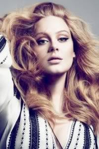
Adele: Very aggressive, confident, over the top, fiery.. You nailed it for me. I love the fashion value in the photo. Personally my favorite photo from you J-Hud. I think you photo was a right match for an Aries. Great job!!!
Natalie: I think there's a great fashion value in this photo for you, and it works well. I do wish, however, that you were wearing a little less makeup! You're pretty, show it!
Amanda: Yuck. Take. Off. That. Mask. Your face looks like a rubbery monster mask. It's UGLY. The styling is good, but I can't get over how terrible your face is. I'm an Aries myself (though I'm no extrovert), and well... I'm kind of appalled by this. I don't see confidence. I just see... rubber. I do like your hair. And the shadows. But... ugh.... sorry Jennifer, I don't like this :/
...20 minutes later...
Amanda: Okay, I've given it a little more consideration. As much as I dislike your face, I see "ram" in it. Forgive me for not seeing that before. I like this a bit more after putting that together... forgive me, I've been really slow lately, not to mention that, being an Aries, I tend to rush into things and jump to conclusions a bit too quickly -_-
Hayley: It's not a literal interpretation, so you've definitely left yourself open to differing interpretations of both your sign and your photo. However, I like this photo and think it fits. Your photo matches your description, which makes sense with Aries. I do wish your eyes were slightly more open, there was a little less of a shadow covering your neck, and you had a bit less makeup, but the pose is confident, the dress is great, the hair is great, and vibe of the photo itself all works really well. Not the best photo we're seeing this round, but still a solid showing and a definite personal improvement for you. Hopefully that improvement will be reflected in the rankings this week. Off-hand, I do think this might be the highest I'll have personally ranked you this Cycle.
TAURUS - DANIELLE
[/size] [/center]
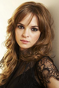
Hayley: This is a tough one. Taurus is an Earth sign, so the setting helps in that regard. Your description definitely helps explain why you're dressed the way you are and that lends itself well to the theme aspect of the photo, too, even if there is a bit of a disconnect between you and the setting. The problem with this photo comes from the modeling aspect. Your bangs are creating a shadow over your eyes and we can't see them. There's nothing inherently wrong with the pose, but it's not strong or memorable, either.
Adele: I like this photo. I think the styling is very suitable for the zodiac and I love the Quail idea too. You looked regal in this photo. I like it. The setting and angle are beautiful too.
Natalie: I think that your eyes are more important than the bird, to be honest. While there is a connection to the theme, the overall lack of modelling aspects drags this down. Sorry, it could be better, but I do think
you'll be safe.
Amanda: Meh. I really don't have much else to add. Like Hayley, I hate your bangs because they completely conceal your eyes. They're too long. I totally see the relation to the theme, but you look so lifeless. For a shoot like this, we want you to be full of life! I also must agree about the low modelesquity value - it looks almost candid and your dress is boring. You're in danger this week, but I honestly think someone else is leaving

GEMINI - DITA
[/size] [/center]
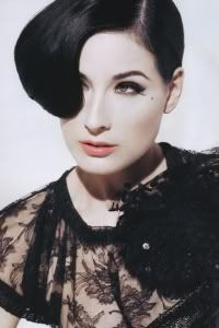
Adele: You nailed it!!! I didn't expect for anyone to come up with fantastic photo and perfectly nailing the theme. But you did it for me. I love the concept. Right description to accompany with your photo. On the other hand, Do we really have to deal with two "Ditas" now. *Shakes head
Hayley: Great theme integration. One of the best this round. I like how similar, yet different both Ditas are in the picture and everything you described fits with the picture and fits with Gemini. Fantastic job this round.
Natalie: I'm not as crazy about it as the other two. It looks very two-dimensional, and comes across as a tad strange. I mean, everything is technically good, but it just comes off as missing something. Even your explanation is great. I guess it's just a bit of a flat picture, and that's what I don't love about it. Still a good job though.
Amanda: I really love this, but like Natalie, something seems odd about it. It almost looks like a painting. I ADORE the concept and the execution, but it almost doesn't look real to me, either. Everything with the theme and modelesquity works amazingly. This really is a good photo, but... is it a photo, or a painting? When I rank stuff, I'm not going to be able to get over that, but it won't get you last, that's for sure.
CANCER - MONICA


Adele: You got the last one. I know it's hard. Your hand really look like a crab but I wish instead of trying to look like a crab (sounds so weird), you would look more and find a photo to match with the characteristic because Cancer is a sign concerned with care, protection, nurturing, highly romantic and even tearful. I guess I want to see a softer side of you more in the photo.
Monica: Well, to be honest, it's not like I didn't try to look hard. I specifically took a trip to the local library so that I could avoid getting an extension, and I did try to find some nurturing photos, but the ones I found either had zero modelling potential or they were covered with words, and thanks to my power outages I couldn't work my usual photoshop magic.
Besides, the shoot description did say:
Your photo can be about the symbol of the Zodiac or the description of that particular Zodiac.
So I didn't think I would get penalized for going with the symbol... :/
(Especially since Cancer is the hardest freakin' symbol in the whole Zodiac to find pictures for. I've seen it done in other series, and Cancer is the last one picked every time.)
Amanda: It's not your best, obviously, but given the situation, it's probably about the best you could do. This is exactly the reason why I didn't want to do this shoot until the final 9 or 8 or so: I didn't want anyone to get stuck with Cancer. This doesn't have the highest-quality modelesquity ever given what you're wearing (well, that and I don't like it that much), but the pose is great for Cancer the Crab and I do like your hair. It's definitely not FCO material, but given the cards handed to you, I definitely see you going through to next round.
Natalie: I think you did a pretty good job this week, all things considered. It's not an obvious portrayal of your theme, but it's a valid one, so I don't think you lose points there. As a modelling shot, the backdrop and facial expression leave something to be desired. Overall, not bad from you, Monica, despite all the issues!
Hayley: Ok, I've been going so back and forth on this picture that I don't even know what I'm about to type. I'll just start typing and see what comes out and base my ranking on what I've said. I see the pincers you're talking about, so that's a nice allusion to your sign. I like how different the photo is and I like the vibe we get from the color scheme. You have the right amount of make-up to make you look good, too. That's about it for the positives from me. I understand you've had a rough week, but I still have to judge based off of what's in front of me. I wish the sign representation was stronger. It's there, but could have been better. You take up most of the shot itself, so the fact that it's a studio shoot actually doesn't bother me at all. If it wasn't a studio shoot, we still wouldn't have seen much of the background.
LEO - KIRSTEN


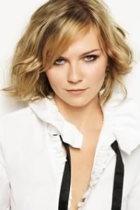
Adele: *DEAD!!!. I didn't expect someone to bring a lion. And here you are, giving us a perfect photo to accompany your choice of Zodiac!!!. What can I say, Kirsten!!! I love the emotion. Nice ring and earring. Nailed it!!! Done!!!
Natalie: I think that compared to your past few weeks, this falls a bit flat. It's very zoomed in, and that lion really catches attention. It's not bad, but you've just been so good. Your mouth is also a bit awkward in this photo. Overall, just okay for me.
Amanda: Love this. It's not as good as your past couple, but the literal injection of a lion, mixed with your own pride and passion. Your eyes are incredible, the jewelry definitely shows pride, and this is just majestic. It's not going to get you another first callout, though, but it's definitely going to put you up pretty high. Good work, once again

Hayley: Yet another strong showing from you. It's not my favorite from you, but when you've done as well as you've done so far, a "not my favorite from you" comment doesn't mean you have anything to worry about. I do love that you have an actual lion in the picture and that you're posing with the lion, instead of it being part of the background. The pride you exude works well, too. You look beautiful as always. The more I look at this picture, the more I actually like it. My first impression was to say "I wish you embodied Leo more instead of just having the lion in the picture". However, after repeatedly looking at the photo and dissecting it, I realized that you really are embodying the sign as well as having that literal interpretation next to you. Great job again this week.
VIRGO - KATE
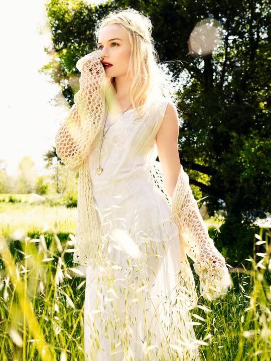

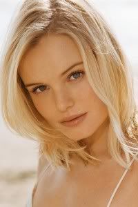
Adele: Damn. Why are you so good at this? I really want to give you a bad critique but this photo is pretty damn good. I love your eyes. Even though you're not looking straight at the camera, I still feel connected to this photo. Amazing Kate. Very angelic side of you.
Natalie: This is fantastic. You nailed everything, in my opinion. I have no critique.
Amanda: That splotch of light to your right side is kind of glaring, if you ask me. But aside from that... totally awesome. Your styling is impeccable, your hair is great... you really do look like an angel. I don't know if I like the hand near your face, but honestly, that's only a minor quibble since it's not covering your eyes or lips or anything. Wonderful work, Kate

Hayley: Phenomenal picture. You've captured the purity and the innocence of your sign perfectly. I love the styling, I love the setting, love the vibe... I just love everything about this photo. I'm not sure you could have done better.
LIBRA - MARION

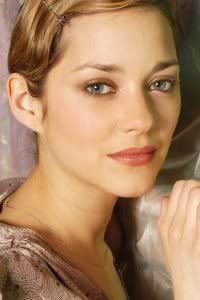
Adele: I really like this. I think the photo reflects Libra really well. Thing I like the most from the photo is your body language. To sit on that thing and still looking fashionable really impressed me a lot. I love the fashion value in this photo very much.
Natalie: I think your emanation of the theme is really strong. I don't love the gray backdrop, but I think this photo has strong modelling aspects in a lot of ways. Good job this week!
Amanda: I don't totally love this. I completely see how you relate to the scales of Libra, but the boring setting and the way you're looking away are... iffy for me. I love the styling, since it fits perfectly, and you definitely look like a model, but your face and head in general are almost an afterthought. Perhaps it's your hairstyle here? I don't know. There are a couple of things missing here, but it's not a major deal, so good job

Hayley: Before I even read your description, I thought "I can see Libra in this". The sleeve did make me think of the scales and I'm not completely sure why. Also, I love that you're balancing on that board, since balance is important to your sign. Your sign itself is even sometimes referred to as The Balance. Your styling and posing are great in this photo. I do wish that the boards you were standing on didn't look so rough, though. It causes a slight disconnect between you and it, making it stand out a little more than it should. Otherwise, big fan of your picture this week.
SCORPIO - KRISTEN


Adele: I really think you did such a great job, Kristen. "People born under this sign are intense, analytical, investigative, probing, digging, wanting to get to the bottom of things". You got this part of description right with your photo. Love the setting, finally. Great job. I'm so happy for you.
Natalie: I quite like this. I think it's a good use of props and black&white photography. I do wish you had a bit more energy, but overall good job!
Amanda: I like it. The black and white adds a risky element that pays off, and your research paid off quite a bit - selling us your photo skills helps. I love the props and setting, your styling is good, and although your face - your lips especially - is a bit weak, it's not enough to drag this down into the abyss of death. Good work

Hayley: I'm not a big fan of your face in this picture. Almost looks like you're working on your orgasm face. I do like the research you put into your sign and your description definitely helps. I also like the impact that's given by this being in black and white. The pose itself is nothing special.
SAGITTARIUS - ELIZA


Adele: I think you did great Eliza. I don't expect everyone to come up with the perfect photoshoot photo. Even though this is a screencap, I don't mind if it really worked out well. I love the intensity in the photo. Just be careful with the angle of your face.
Hayley: Very tough round for you it looks like. This is an instance where I'm fine with a screenshot. You probably had no other Sagittarius pictures to choose from, and Eliza still looks like she's posing in this still, so it works on that level, too. The literal sense of the Sagittarius with the archery definitely works well in your favor this round. There's a strong connection with the theme because of it. The modeling could have been better, but it's probably the best of what you had to work with. Not your best week, but hopefully not your last, either. I think that your theme integration could be your saving grace this week. It probably will be in my rankings.
Natalie: Oh the screenshot. I think this is a nice pose, and you've done well for the theme, but the fact that it's a screenshot doesn't help your case. I don't really think you're in danger of elimination this week, but you've certainly done better. I expect no less than a comeback out of you

Amanda: I hate screencaps with a passion, but despite the low, grainy quality of this one, it actually looks more like a modeling shot than most of the others I've encountered. I definitely see "archer" and when mixed with "Zodiac," I immediately think "Sagittarius." Although your modelesquity is low, the pose is great and I love the setting. It's just that it's a screencap, but given your hand, it's what you could do. It's not awful, it's not great, but it's enough to keep you going so we can see the Eliza we've enjoyed so far next round.

CAPRICORN - ASHLEY


Adele: I guess you decided to channel the materialistic and ambitious one for Capricorn. I like your style in the photo. The setting is great too. Your profile shoot wasn't bad at all but I don't think it was amazing either. No matter what, I think this photo is pretty much memorable for me
Natalie: This is memorable, and your profile is gorgeous. There's quite a bit going on, but I actually like the action shot here. Good job this week!
Amanda: I don't exactly like it. I don't exactly hate it, either. The action shot is something nice and different, but it's a total profile, and all I can see of your face is your overdone makeup. I also don't see "Capricorn" based on your description. You're attacking him instead of trying to resolve the issue like a Capricorn would. I'm not too sure about this, Ash. There are some things I like, at least - the styling, the idea, the risk... but they're not enough to get me to like this photo. I'm neutral. That's probably enough for me, though <3
Hayley: Instead of copying the description for Capricorn, it probably would have helped you to explain why you chose this photo for this shoot. Right now, other than picking up on one word in the description, I don't really see the connection. And even then, the connection to that word is "I can kinda see it". So, this week, for me, it's a weak connection to the theme. However, I like the picture itself. I saw it at first glance before the one you posted stopped showing up. As far as I remember, the quality was better than the reposted one and there was no text in the upper-righthand corner, so I will not count off for that in the repost. I like the action shot, I like the pose, and I like the styling. Also, this is a fairly memorable photo. This week, you delivered in the modeling area, but you were lacking in the theme department.
AQUARIUS - BRITNEY


Adele: You looked beautiful in this photo. I love the concept. It's a tough week. I don't expect everyone to come up with the photo exactly look like a the Zodiac symbol. I love the color in this photo. Good effort. Much better than last week.
Hayley: I definitely see the connection between you and your zodiac in this shot, so good job in the theme department. I also like that you are nude, but not vulgar in this photo. I think your pose is fine, but would have preferred if your arms didn't look so tense. A little bit more of the body would have been nice, too. Overall, this is still a strong photo and I'm sure you'll be fine.
Natalie: I think the theme is really evident here. I agree that your arms could be less tense, though. Overall, great job! I really like your emotion in this one.
Amanda: Where I live, Aquarius is a sign in the winter, and I definitely get the vibe that this water is icy, which not only incorporates what Aquarius is, it adds a little extra touch that makes this perfect. Really now, you look amazing, and you're not trashy despite being completely naked. This is amazing, Brit. It's tranquil, it's relaxing, it's everything it needs to be. If I had to be nitpicky, I'd chastise your eye makeup but in all honesty, I actually like it. This is one of the best photos I've seen in a while. GREAT work here

PISCES - EMILIA
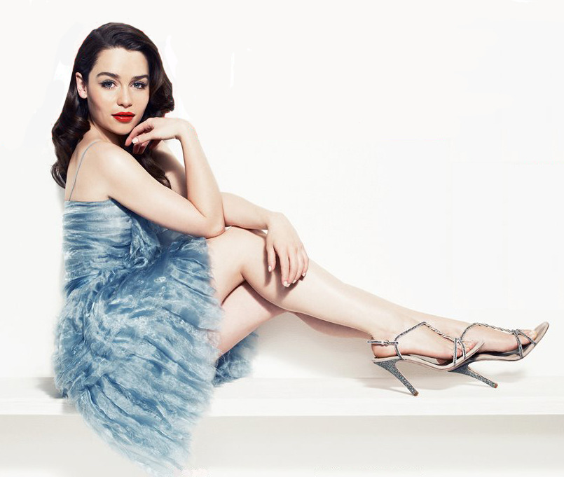

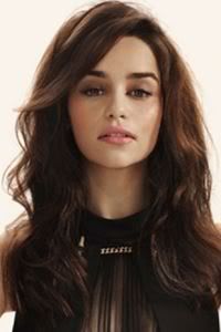
Adele: So for Pisces, you were supposed to be imaginative, compassionate and also deceptive/too vague. You look great but my problem is I don't really convinced with the emotion that you try to portray here. I think your hand gesture could be more graceful, and soften up your body language a little bit. It would be more better. But your styling here is great.
Natalie: Hmm. I voted to save you last week, and now I am not so sure about that decision. While your eyes look better, I fail to see much of a connection to the theme here. Sorry! Also, just as a shot in general, it really doesn't hold my interest.
Amanda: Modelesquity? High. Styling? Great. Pose? Wonderful. Relation to the theme? Absolutely none. Let's go over what Adele posted in the shoot description, along with Amanda's elaborations on each point:
Intuitive
You clearly seem to be thinking about something here, so this definitely is present in some form.
Psychic
This one is hard to pull off. Unless you're Gemma Arterton.
Most spiritual
I don't see any sort of "spirit" here. Again, hard to pull off, but YOU HAVE NO SETTING, so...
Sympathetic, Empathetic, Compassionate
You look extremely apathetic here. I don't see this in the slightest, and that's a pretty major problem.
Positive energy
Another problem. You have NO energy. You're this lifeless statue lost in thinking...

Right.
Imaginative
This is my biggest problem. When I think "imaginative," I think something artistic, something memorable, something flamboyant, something portruding the cliches of the current, something that goes above and beyond the norm. Again, I must take note that you lack a setting and that's a pretty catastrophic problem for this.
I think I've made my point. The relation to the theme is extremely weak to the point that ANY redeeming qualities of this photo go up in smoke. The styling may be great, but it doesn't do justice to you or the theme. You look like a model, but the lack of a setting takes away what the modeling could be. I'm sorry, Emilia, but based on this, I don't regret wanting to keep Penelope, and it looks like you may be sleeping with the fishes this round :/
Hayley: Ok Emilia, you've struck me as a seemingly nice person, so I don't want to rub salt in the wounds and talk about whether or not the decision that kept you here was right or wrong. You had enough support from a couple of the judges and a higher average callout that kept you in. I'd rather talk about this round. The only part of your description that clicks for me is the look of intrigue in your face. Like Amanda, if you were going to bring up the Imaginative aspect of the sign, I would have preferred something more than just a studio shot. I would have liked to have seen a more artistic vision represented in the photo. The color of your dress and the fact that it's a bit reminiscent of waves probably helps you this round since it does reference your sign.


